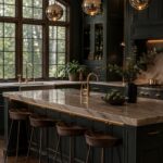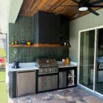
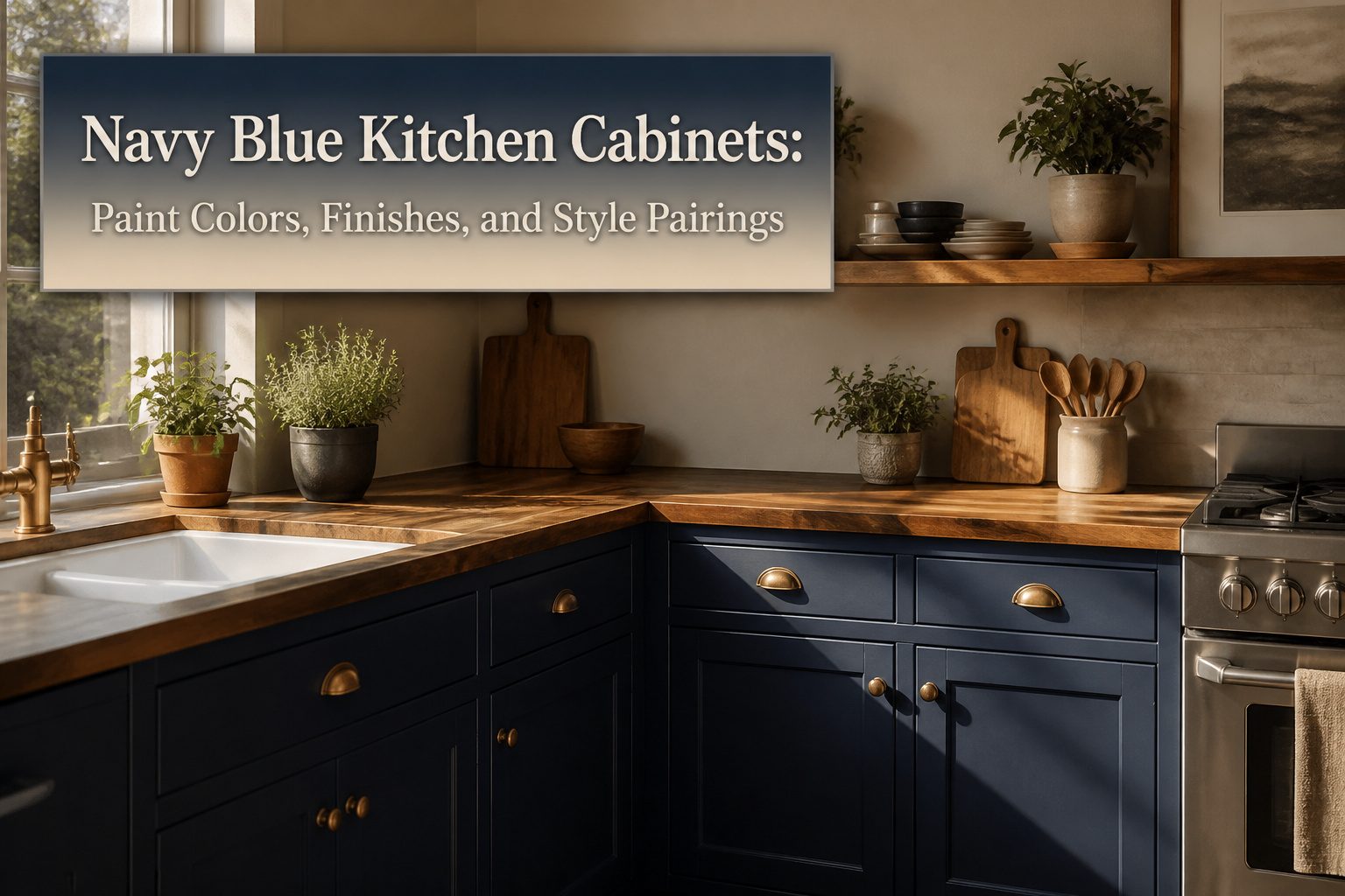
Navy blue kitchen cabinets are painted base and wall units in deep blue tones, usually between midnight and true navy, finished in matte or high-gloss lacquer.
The color only works if you keep it below eye level in smaller kitchens; dark uppers swallow light and shrink the room.
Hale Navy HC-154 and Naval SW 6244 are the two starting points most designers actually use, and they sit on opposite sides of the warmth divide.
Hale Navy HC-154 and Naval SW 6244
Every roundup of navy blue kitchen cabinets starts with the same two names for good reason.
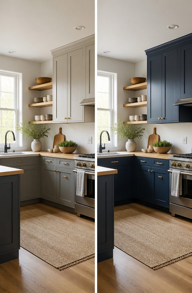
Hale Navy HC-154 by Benjamin Moore sits on the warmer side of the divide, reading almost charcoal in low kitchen light and opening up to a true, grounded navy when the sun hits it straight on.
Studio McGee built a whole kitchen around it, and that warmth is why it pairs so cleanly with wood tones that lean honey or oak rather than ash.
Naval SW 6244 by Sherwin-Williams earned its spot differently. Sherwin-Williams named it 2020 Color of the Year, and in kitchen light it stays cooler and more decisive, a blue that holds its own against white countertops without softening toward slate.
Where Hale Navy can look almost brown in a shadowed corner, Naval keeps reading as color.
Blue kitchen cabinets offer a charming blend of sophistication and renewal, adding a fresh vibrancy to the space.
That freshness lands differently with each paint.
Hale Navy works when you want the cabinets to feel like furniture, something built in and settled. Naval wins when you want the navy to do the design work itself, especially in a modern kitchen that needs sleek over storied.
Both handle brass and matte black hardware without fighting, but Naval reads crisper against those metals. My own preference tilts Hale Navy for traditional or transitional spaces, Naval for clean-lined rooms where the architecture is doing less talking.
You choose between warmth and forgiveness, or cool precision and a color that stays put under every light condition.

Includes 30 featured and newest released color card. Sprayed on color to see our colors in your homes lighting for more accurate color choices.

Ready to use, pre-mixed door and trim paint offers a fresh new look on interior or exterior metal, wood and fiberglass

Includes 30 featured and newest released color card. Sprayed on color to see our colors in your homes lighting for more accurate color choices.
Van Deusen Blue HC-156 and Midnight Blue
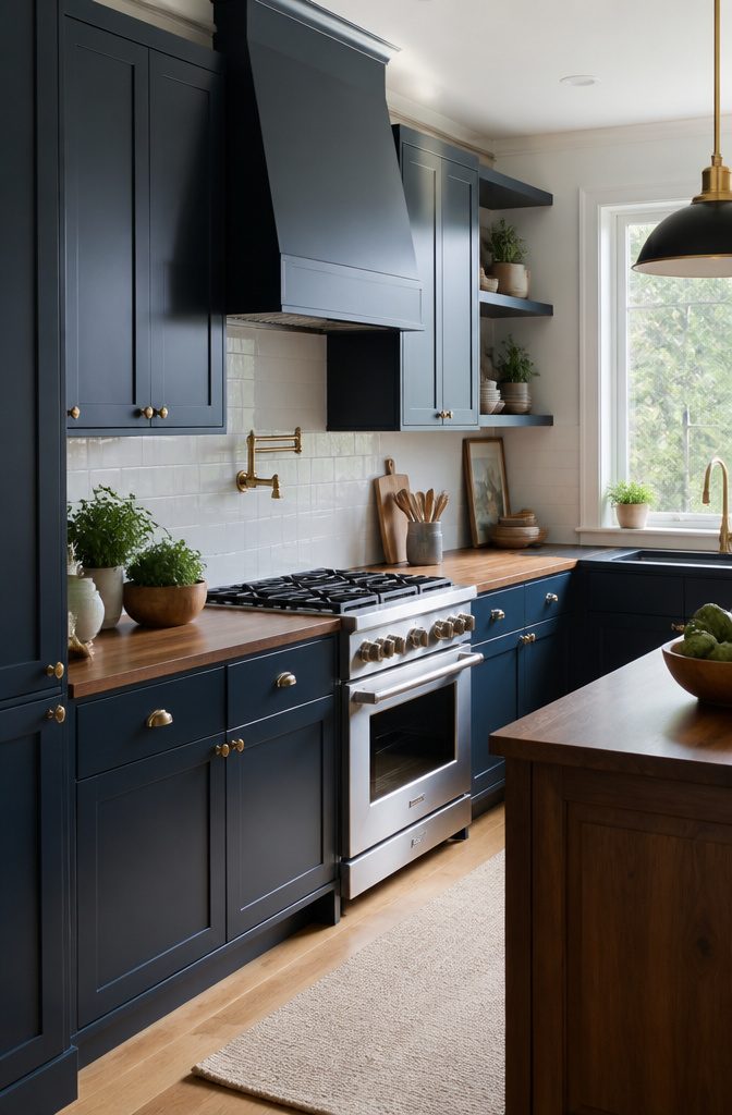
Van Deusen Blue HC-156 carries more gray than a true navy, which is why I reach for it when a kitchen needs the depth without the formality.
Studio Dearborn used it with warm wood tones and gold, and that combination works because the gray undertone keeps the gold from reading brassy.
It is one of the few Benjamin Moore blues that can shift coastal or urban depending on what surrounds it.
Midnight Blue without a manufacturer named is harder to pin down, since several paint lines carry the name.
In those cases, I assume a deep, neutral navy with balanced undertones, not too teal and not too purple, and I test against Hale Navy HC-154 or Navy Masterpiece to see where it lands.
If the sample pulls darker and flatter, it probably shares DNA with the off-the-shelf navies used in builder-grade cabinet programs.
The safe move is to compare it to Van Deusen in natural light: more gray means less risk of the color going muddy beside warm countertops, but it also means less of that saturated richness people picture when they first search navy blue kitchen cabinets.

Material and Size:DGAGA chalk paint is made of Water-based acrylic resin, water, toner, additives; 4 OZ(118ml) 1 jar,size:1.97*1.97*2.56 inches.Our furniture paints are secure and non-toxic, Strong tinting and hiding power,and paint paste ingredients are uniforms mixed. furniture redesigns have never been easier.

[UNIQUE BRUSHED EFFECT: Rust-Oleum Milk Paint makes furniture details stand out. With the unique brushed effect and washed matte look, it turns old furniture into an eye-catching piece that transforms your living space, EASY TO CLEAN, SAFE TO USE: Milk Paint is a water-based formula that cleans up easily with soap and water. The low VOC and low odor formula make it easy to work comfortably indoors, LARGE COVERAGE, FAST RECOAT TIME: Each quart covers up to 125 sq. feet. Dry to the touch in just 30 minutes, able to recoat after 1 hour. Recoat multiple times to obtain desired color, PROJECTS DONE FAST: No need for primers; features excellent adhesion in a one-step buildable coating, making it easy to finish new or vintage pieces fast. One coat creates a semi-transparent look; additional coats customize the look, LET CREATIVITY SHINE: Premium matte finish can be layered with different techniques for a custom look. Try brushing on in a “V” pattern for a vintage, washed look. Go a step further and use light sanding to create a weathered texture]

All-in-One Formula: This furniture paint includes a built-in primer and top coat, providing seamless application on wood, metal, laminate, and more surfaces for a hassle-free painting experience.
Dark Navy PPU14-03, Gentleman’s Gray 2062-20, Indigo Batik SW 7602, and Mysterious AF-565
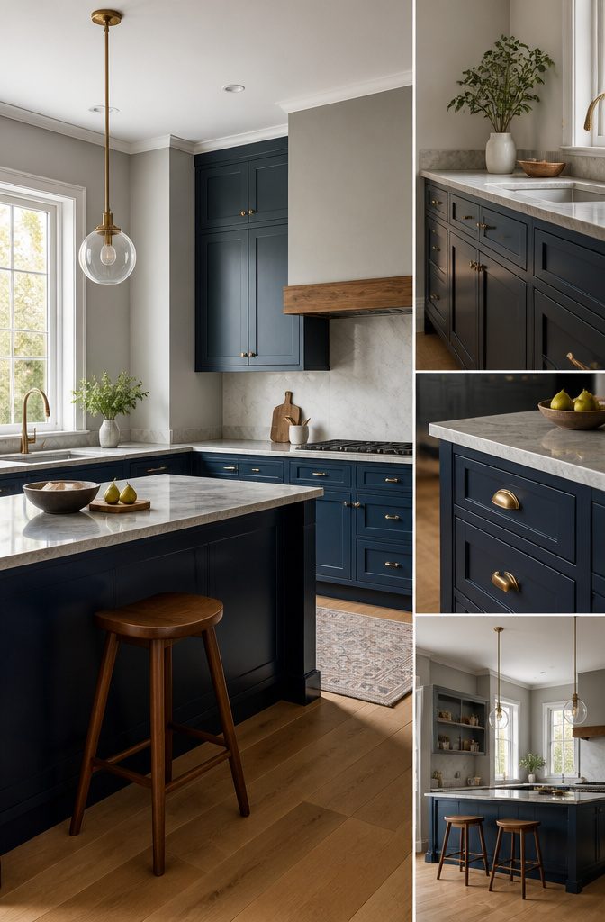
Dark Navy PPU14-03 sits closer to charcoal than true navy, which makes it the safest pick when you already have cool gray flooring or countertops you cannot change.
The undertone reads almost black in low light, so I only specify it for kitchens that get decent morning sun or have enough recessed lighting to keep the corners from falling flat.
Gentleman’s Gray 2062-20 carries a teal current that opens up pairing options most people miss. Brass hardware turns almost green against it, which works if you commit to the whole mood, but satin nickel keeps things quieter.
I have seen this color read almost petrol in rooms with northern exposure, so test it at the time of day you actually use the kitchen.
Indigo Batik SW 7602 and Mysterious AF-565 sit nearly on top of each other in the fan deck, but Batik runs slightly redder while Mysterious stays firmly in the blue-purple camp.
That difference matters for backsplash choice: Batik wants warm white subway tile; Mysterious needs something with a gray cast or it turns the walls pink by comparison.
Both handle open shelving in light oak without clashing, which is more than I can say for the greener teals in this group.

Belong To Your kitchen: The kitchen cabinet features 2 large door cabinets and 2 full extension drawers great for storing coffee beans, seasoner, spare kitchen paper, or some sundries. Meanwhile, your coffee maker, toaster, can sit on our wide tabletop

ALL-IN-1 PAINT & PRIMER: A hardy multi-purpose and multi-surface one-coat paint and primer in one for almost any indoor or outdoor surface. A wall, ceiling, floor, skirting board, cabinet, furniture and door paint for your bathroom, kitchen, home and garden.

Large Storage Space: Featuring an extra tall space-saving structure with 60" wide table top, 4 concealed cupboard storage each with easy-glide drawer, this modern buffet cabinet keeps things organized and tidy while serving your guests in style. Overall Size: 15.75" D x 60" W x 36.02" H
Matte and High-Gloss Finishes
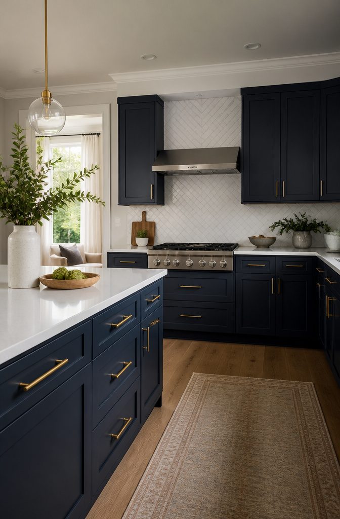
Matte navy blue kitchen cabinets absorb light instead of throwing it back, which gives the room a soft, velvety look that reads as contemporary and high-end.
That same quality makes them forgiving on fingerprints and small smudges, a real advantage if the kitchen sees daily traffic from kids or roommates.
I tend to steer clients toward matte when they want warmth or when the cabinets themselves are the statement piece, especially paired with wood accents, brass fixtures, or natural stone countertops.
High-gloss navy does the opposite work. The finish reflects both natural and artificial light, which makes a small or light-starved kitchen feel brighter and more open than the walls alone would allow.
Gloss amplifies the richness of the navy itself, and it suits urban apartments where square footage is tight but the aesthetic ambition is not.
Maintenance is the cost: every water spot and fingerprint sits on the surface like a smudge on a mirror, so the owner commits to more frequent wiping.
Two ways to play this. Matte wins for a household that wants softness and less fuss.
Gloss wins when the room needs the light, and the owner accepts the upkeep. In my experience, the decision comes down to which problem matters more: a dim kitchen or a high-maintenance finish.

Natural Elegance Built To Last: Freestanding bathroom storage cabinet made from 100% solid Brazilian pine with a Navy Blue finish that warms up any bath or powder room.

[Classic and Modern Design]:The cabinet door panel is carved with symmetrical pattern, beautiful shape, good air permeability.Unique black metal pulls add a chic touch.Not only is it great for storage, but it can also be a decorative addition to your home

IDEAL SIZE: At 12"D x 36"W x 36"H, this cabinet features two interior sections measuring 9.5"D x 15.1"W x 22.3"H each, offering a compact yet efficient layout for everyday storage.
Gold, Brass, and Black Hardware Pairings
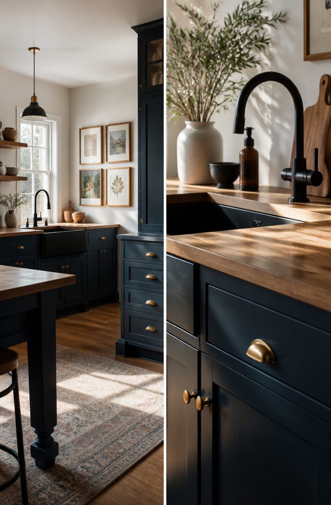
Gold hardware against navy blue kitchen cabinets reads as the warmest of the three choices, and it is the one most sources single out when they want the combination to feel deliberate rather than safe.
Brass, especially aged brass, carries more rust and depth than polished gold, which makes it the better fit when your kitchen already has wood elements or vintage lighting you want to keep coherent.
Matte black flattens the contrast and pushes the whole room toward modern, though the sources disagree on whether it wins or merely works; one calls it bold, another notes navy stands out with gold tone instead.
For pulls and knobs that wear well, aged brass ages in your favor, hiding fingerprints and the small scratches that polished finishes collect.
Gold demands more wiping. Black shows dust on matte surfaces but resists the visible wear that bright metals get at the edges.
My preference runs to aged brass for a navy kitchen that needs to feel settled in, and to black only when the rest of the house is already speaking in flat, clean lines.

Value Hardware Set: this set includes 10 cabinet knobs and 5 drawer pulls, providing a unified look for your furniture; Ideal for full room upgrades, it eliminates the need for separate purchases; A complete cabinet hardware set to refresh your kitchen or bedroom in one go

Rugged & Durable Structure: Our gold dresser knobs are made of solid zinc alloy & pink natural crystal stone, each weight of 1.05 oz (30 grams), very rugged and durable. At the same time, the surface is treated with brushed brass, corrosion resistance, not easy to rust, and ensure longer service life.

Size & Tips: We'd better suggest you check & confirm the size of the cabinet handles you need before purchasing.
White, Gray, and Gold Color Combinations
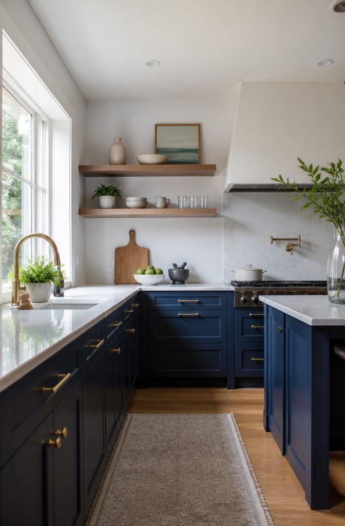
White countertops, backsplashes, and walls give navy cabinets the breathing room they need.
The contrast keeps the kitchen from feeling like a cave, but restraint matters. Use white on fixed surfaces, the ones you do not touch often, and let the navy carry the visual weight below eye level.
I have seen kitchens where white upper cabinets fight the navy lowers for attention, and the room ends up looking like two kitchens collided.
Gray works differently. A light gray wall or countertop pairs with softer blues like Watery or Waterloo for tonal depth without stark contrast.
In a navy kitchen, gray risks muddying the palette unless you commit to one temperature. Cool grays with cool navies read sophisticated; warm grays against navy look like a mistake you are trying to justify.
Gold or brass hardware is where the warmth comes in. The 70/20/10 rule holds here: roughly 70 percent navy, 20 percent white, 10 percent gold.
Brushed gold handles or a satin brass faucet add the accent without tipping into boutique-hotel excess. Polished gold can read flashy fast, and too many metallic surfaces compete rather than complement.
Keep gold to hardware and maybe one pendant light. Spread it across every fixture and the kitchen starts performing for visitors instead of working for you.
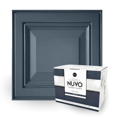
Regal Navy Elegance: Oxford Blue, a bold, true navy, mirrors the official color of the prestigious English University, ideal for both modern and classic decor.

Use for a variety of indoor and outdoor project surfaces including wood, metal, plaster, masonry or unglazed ceramic

Oxford Blue is a true navy, satin finish cabinet paint - part of our Modern Collection.
Two-Tone Cabinetry With Navy
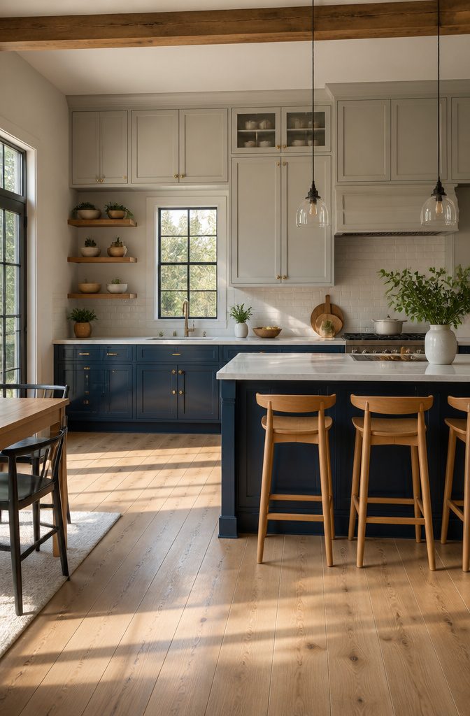
Two-tone cabinetry is where navy blue earns its place in most kitchens.
Putting the darker color on the lower cabinets and a lighter tone, white or light gray, above keeps the top half airy while the navy grounds the visual weight where your eye naturally rests.
The break line should sit at standard countertop height, about 36 inches, so the transition reads as intentional architecture rather than a cabinet that ran out of paint.
This arrangement matters most in the kitchens I see people actually living in.
An all-over dark color swallows the natural light and shrinks the room from every angle; navy below and Crisp White or similar above lets a smaller kitchen feel open without giving up personality.
Some designers run navy on the upper level instead, pairing it with vintage chicken wire glass or matte black tile for a more playful contemporary look, though that demands more confidence with contrast.
The real limit is how much darkness the room can handle. If the kitchen is modest in size or the windows face north, the lower-only rule is the safer call.

【Non-Toxic and Safe】This chalk acrylic paint set includes - 4 oz / 118 ml bottles of chalk paint. The colors of Wood paint set includes: Black and White furniture paint

All-in-One Formula: This furniture paint includes a built-in primer and top coat, providing seamless application on wood, metal, laminate, and more surfaces for a hassle-free painting experience.

SUPERIOR COVERAGE ON VARIOUS SURFACES: Dive into your next DIY project with our all-in-one paint, designed for superior coverage on multiple surfaces. Tackle wood, laminate, metal, glass, resin, or cement with ease. Achieve a smooth finish with fewer coats for maximum impact. Whether you’re after white wood paint for furniture, matte black paint, or pink paint for walls, our versatile furniture paint no sanding all in one works with spray guns and airbrushes for seamless application.
Navy in Modern, Traditional, and Coastal Kitchens
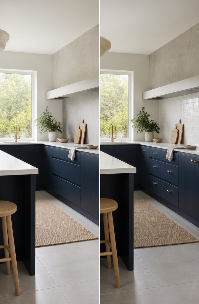
Navy blue kitchen cabinets shift their personality entirely depending on what you build around them. In a modern kitchen, the winning move is a slab door with minimal hardware.
The flat panel keeps the color from feeling busy, and thin bar pulls or recessed channels let the navy read as architecture rather than decoration. I would skip any visible hinge or ornate pull; restraint is everything here.
Traditional kitchens ask for the opposite. Raised panel doors, maybe with a simple step inside the frame, and crown molding where the cabinets meet the ceiling.
The navy here feels intentional and grounded, not trendy. I tend to pair this with warmer hardware, oil-rubbed bronze or antique brass, because polished chrome fights the classic detailing.
Coastal is where navy lives most naturally, but keeping it from turning nautical in a cheap way takes care.
Beadboard paneling on the cabinet doors does the heavy lifting, and I like to bring in natural fiber accents, wicker bar stools or a jute runner, that soften the blue without cliché anchors and rope.
What sinks coastal kitchens is over-themeing; let the beadboard and a brass ship-light or two do the work, then stop.

Elegant and luxurious design: The storage cabinet with spiral grain doors integrates functionality and elegance. With its complex and eye-catching sunlight design, it can ensure that it stands out in your room and becomes a dazzling focal point.

Elegant & Modern Design – Elevate your home with this stylish sideboard cabinet, featuring a sleek silhouette and unique water ripple design for a touch of sophisticated glamour. Its meticulous detailing makes it a stunning focal point in any modern space.

Dimensions: 59.8" (L) x 15.7" (W) x 33.7" (H)
Small Kitchens and Space Perception
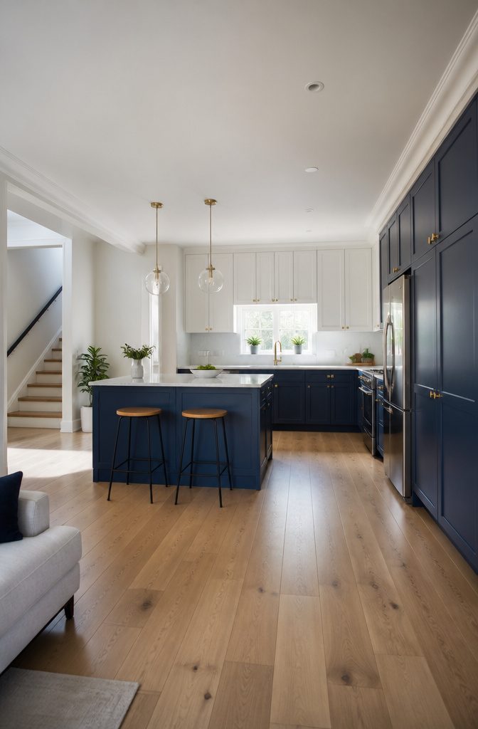
Navy blue works in a small kitchen when you keep it low and let the light stay high.
The compression people worry about comes from dark surfaces catching eye level on every side, not from one band of color at the base.
I like navy on lower cabinets paired with white or light uppers, or navy on an island with the perimeter kept bright. That move still reads deliberate, not apologetic.
Reflective surfaces help, but there is a stopping point. Glossy finishes and light countertops bounce light around the room, which matters when the footprint is tight.
Matte navy absorbs light and gives a softer, velvety look that can still feel high-end in a small space, though it needs more help from the surrounding materials. Brass fixtures and natural stone countertops pair well with either finish.
The overcorrection I see is piling on every bright trick at once: white cabinets above, white backsplash, white countertop, reflective hardware.
At that point the navy starts looking like a mistake you are trying to hide rather than a choice you made. Pick two light elements and let the navy hold its own weight.

BOHO Style: Boasting delicate rattan arched doors and light natural wood finish, this rattan buffet cabinet acts as an eye-catching statement piece and fills your dining area, kitchen or entryway with elegant bohemian vibes

【Stylish Rustic Farmhouse Design】 This executive desk brings the charm of classic farmhouse style to your workspace. Featuring a rustic wood finish paired with white accents and uniquely designed drawer panels, it creates a warm and personalized atmosphere. Perfect for homes, offices, or commercial spaces, it enhances the overall aesthetic while seamlessly blending with any décor.

Hollow Carved Accent Cabinet: Designed with two beautifully carved grille doors, this accent storage cabinet blends vintage character with contemporary style. The intricate cut-out patterns create a decorative focal point that elevates the look of any living room, entryway, or dining area.
Cleaning and Maintaining Navy Cabinets
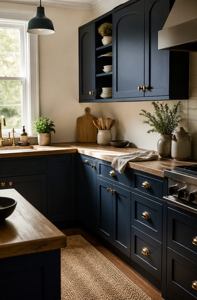
Navy hides daily grime better than white cabinets, but every fingerprint and flour streak still lands on the surface. A soft cloth with mild soap and water handles most cleanup without stripping the protective coat.
Skip bleach-based sprays and abrasive scrubbers; they break down the finish over time and leave the color looking chalky where the sheen used to be.
Mid-tone wood forgives more because grain texture masks small marks. Navy sits in the middle: the dark base camouflages dust and light splatter, yet the smooth painted surface reflects light in a way that shows oil from hands.
The UV protective layer most navy finishes carry slows fading, but it only works if the surface stays intact. Harsh chemicals wear through that barrier faster than plain wear does.
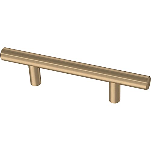
STYLE: Modern handles add a sleek look to kitchen cabinets, dressers, furniture

365-Day Evaluation: We're confident you'll appreciate the Ravinte handle. We invite you to use it for a full year, and if it doesn't meet your expectations, we're here to assist

About Quality & Material:The Cabinet Knobs are Made by 100% Zinc Alloy Solid Material. You Can Use it for a Long Time;We provide a 30-day free return and exchange service, so you can buy with confidence! If you have any questions,contact us by email soon.
Ready-to-Assemble Navy Cabinet Options
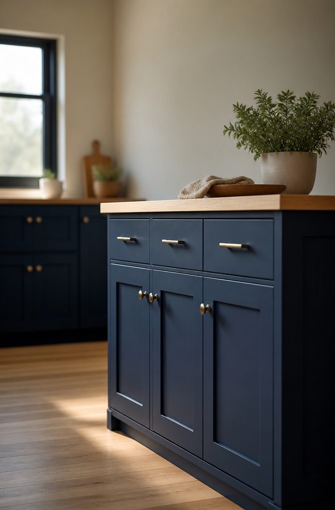
Ready-to-assemble cabinets ship flat, which is where the savings start. The Salem Navy Shaker runs a basic kitchen at $1,659 with a UV coating paint finish, while the Lexington Blue lands at $2,286 for a recessed panel profile.
Both arrive in 5 to 8 business days, and the assembly itself is straightforward enough with pre-drilled holes and labeled parts.
I see the appeal for anyone working on a weekend timeline and a tight budget. The price gap against custom work is real, often thousands.
But the quality gap shows up around the two-year mark in ways the upfront price does not warn you about. The finishes on RTA stock tend to wear at edges and high-touch zones faster than site-finished or factory-sprayed custom doors.
Joints loosen slightly with seasonal expansion, and the hardware holes, pre-drilled for speed, give you less room to adjust if a door starts sagging.
For a rental or a first home you plan to sell inside five years, RTA navy cabinets make sense. For a kitchen you intend to live with daily for a decade, the savings cost more later.
Wood Accents and Patterned Backsplashes
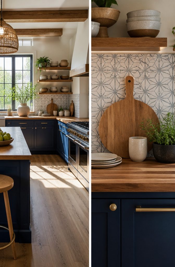
Navy blue cabinets read formal by default, which is why I always look for one place to bring in wood.
Butcher block countertops do the softening work from below, grounding the color in something farmhouse or Scandinavian kitchens already understand. The warmth sits right against the cool depth of the blue without fighting it.
Open shelving above navy base cabinets is the lighter alternative.
It keeps the wall from going flat and heavy, and natural wood shelves in particular turn the contrast into something current rather than rustic kitsch. Brass-accented metal shelving works too, though it shifts the mood toward modern.
Backsplash pattern is where I see the most dated choices. Subway tile in a straight stack reads current against navy; the same tile in a staggered brick layout with heavy contrast grout can feel like a 2012 Pinterest board.
Small-scale geometric or handmade-look tile holds up better than large printed patterns, which tend to compete with the cabinet color instead of complementing it. Wood and pattern both need restraint, but one of them absent usually leaves navy feeling stiff.
Navy as Accent in Wallpaper and Appliances
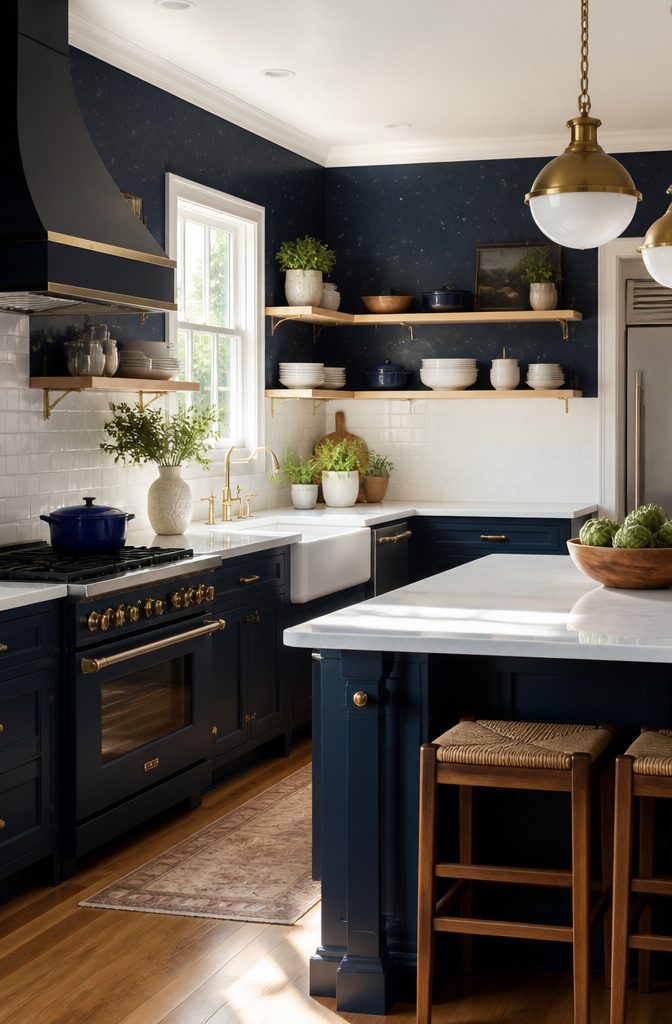
Navy wallpaper above eye level lets you sample the color without touching a single cabinet door.
In one Philadelphia kitchen, starry night paper ran the wall tops while the cabinets stayed white, and the ceiling height carried the contrast instead of the base cabinets carrying the weight.
Patterned tile above the range picked up the same navy, which tied the two ideas together without either one dominating the room.
The appliance route costs more and commits harder.
A La Cornue range in navy blue with brass trim becomes the kitchen’s focal point the moment it slides into place, and the color has to coordinate with everything around it because a $10,000 range does not read as a trial.
Matching dining chairs to the range doubles down on that statement, which works when the rest of the room stays quiet.
Navy on cabinets is the commitment; navy on walls or appliances is the question.
Wallpaper makes sense when you want to test whether you can live with the color near your morning coffee. Appliances make sense when you already know the answer and want the color built into something you use daily.
What reads as indecisive is putting navy in three temporary places at once, wallpaper here and a kettle there and a runner underfoot, each one pulling in a slightly different direction.
Pick one accent, make it the right scale for the room, and let it do the work alone.
Frequently Asked Questions
What colors go well with navy blue kitchen cabinets?
White, gray, and gold or brass accents pair best with navy blue kitchen cabinets.
The 70/20/10 rule works here: roughly 70 percent navy, 20 percent white, and 10 percent gold in hardware or fixtures. Cool grays stay sophisticated with cool navies, while warm grays tend to clash.
Are navy blue cabinets still in style?
Yes, navy blue cabinets remain a strong choice across modern, traditional, and coastal kitchens.
The color functions as a neutral with depth, shifting from formal to relaxed depending on door style and hardware. Slab doors read contemporary; raised panels read traditional; beadboard reads coastal.
How do I clean and maintain navy blue cabinets?
Wipe navy cabinets with a soft cloth and mild soap and water.
Avoid bleach-based sprays and abrasive scrubbers, which break down the protective finish and leave the color chalky. The UV protective layer most navy finishes carry slows fading, but only if the surface stays intact.
Can navy blue cabinets work in small kitchens?
Yes, when kept low and paired with light colors above.
Navy on lower cabinets with white or light uppers, or navy on an island with a bright perimeter, prevents the room from feeling compressed. Glossy finishes and light countertops help bounce light in tight spaces.
What finishes are available for navy blue cabinets?
Matte and high-gloss are the two main finishes.
Matte absorbs light for a soft, velvety look that hides fingerprints and suits busy households. High-gloss reflects light to brighten small or dim kitchens, though it shows every water spot and fingerprint and needs more frequent wiping.