These kitchen style trends for 2026 range from a cabinet hardware swap to full stone cladding, so the deciding factor is how much of your existing kitchen you can live with versus how much you need to change.
A warm neutral repaint on cabinets you already own costs a weekend and your own labor; bookmatched stone surfaces run far past that and demand professional install from start to finish.
One detail I keep coming back to is fluted glass in cabinet doors, the ribbing distorts clutter just enough while interior lighting turns the cabinet into a lantern at night, but place it too near the cooktop and grease settles in those grooves fast.
1. Warm Neutral Kitchen Colors
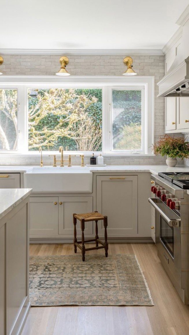
Warm neutrals are replacing the cool grays that dominated the last decade, and the shift is easier than a full repaint.
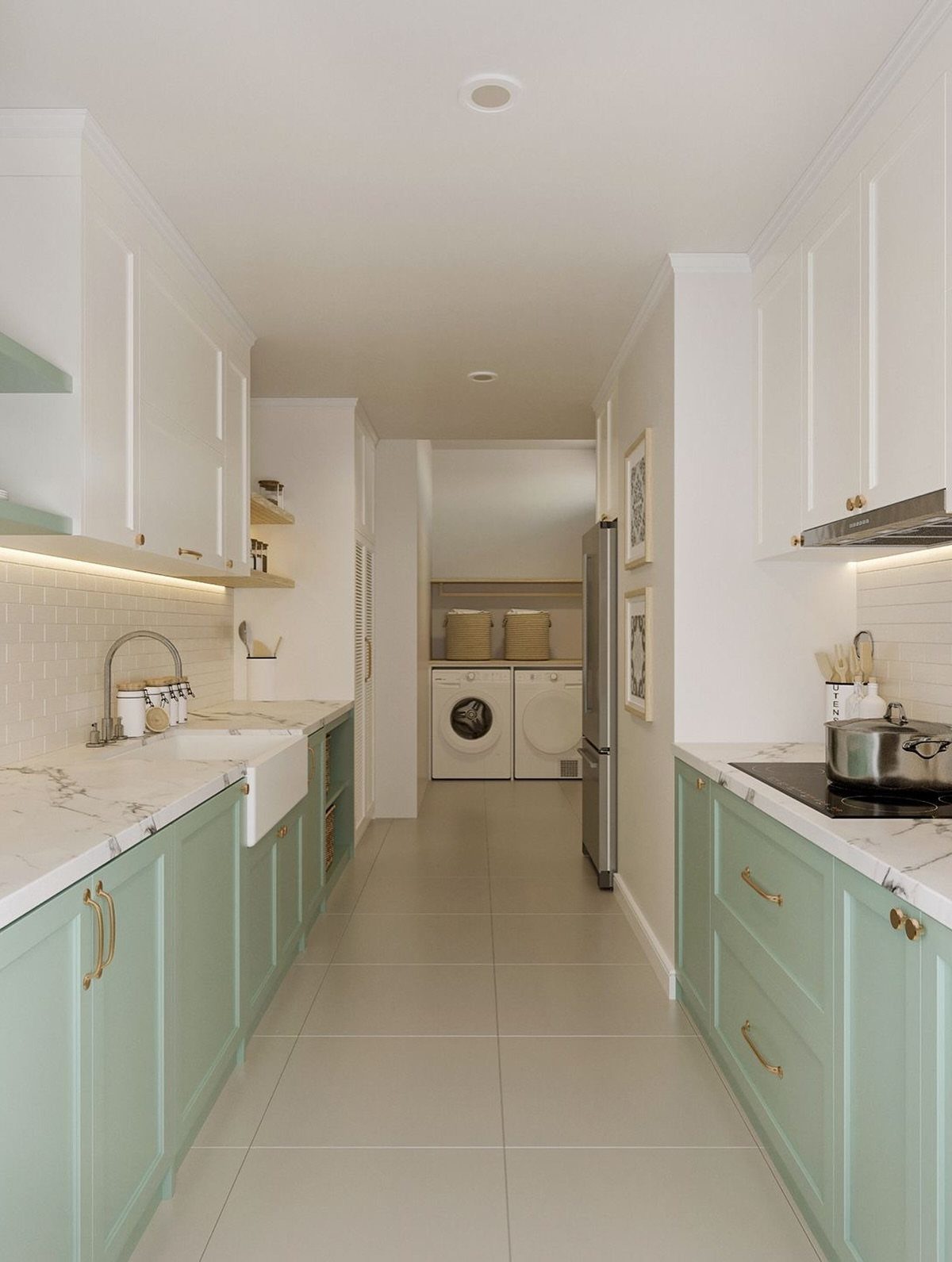
Warm gray cabinets with enough brown underneath feel settled instead of sterile, and they pair with more finishes than a cooler tone allows. Gold hardware and a farmhouse sink keep the look approachable rather than trendy.
For renters or first-home owners, this palette forgives existing finishes you cannot change: beige tile, honey oak trim, off-white appliances.
I would start with the cabinets and let the walls follow. A warm neutral base also ages better than a bold color choice you might tire of once the novelty wears off.

Hearthstone is a warm greige, satin finish cabinet paint - part of our Rustic Collection.

CABINET TRANSFORMATION: Refresh outdated cabinets, vanities, furniture and trim with rich Espresso color and a smooth semi-gloss finish

🏠DETAILS: Size-15.8 X78.8 INCH, total 8.65 sq.ft(40cmX2m), Self adhesive wallpaper (No extra glue needed). Made of durable vinyl, Cream beige wallpaper peel and stick, waterproof. Fully removable. Renter friendly.
2. Hidden Pantries
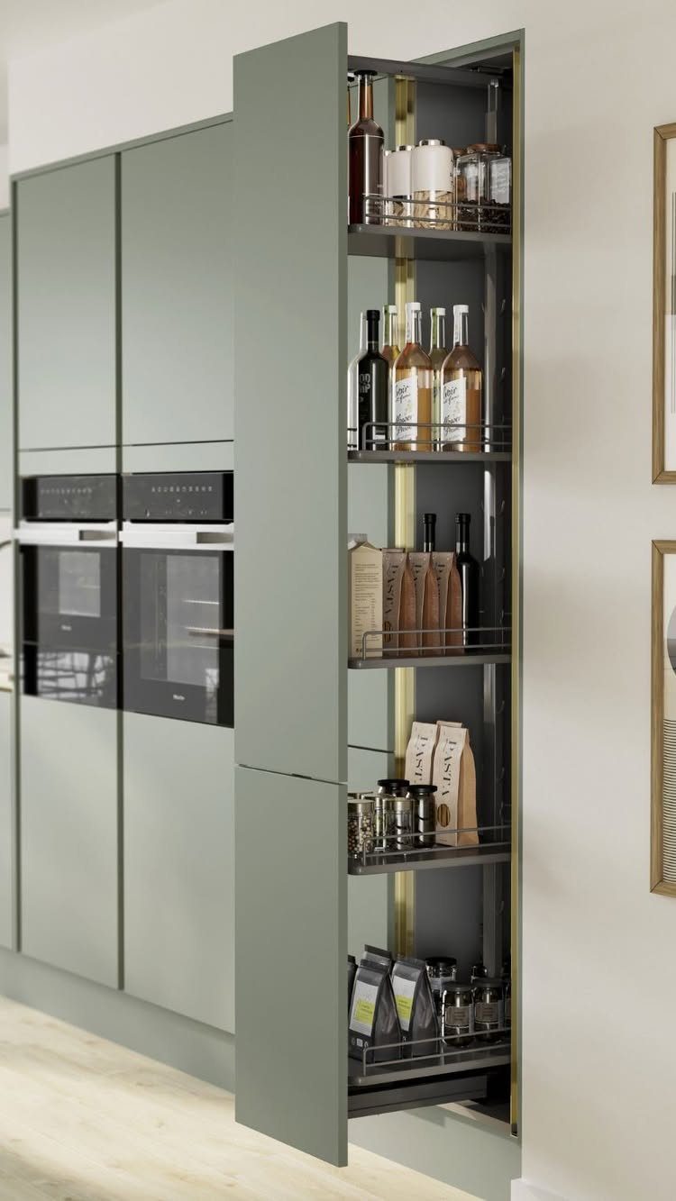
A pull-out pantry turns the narrow gap beside a refrigerator or oven bank into usable storage without the footprint of a walk-in. A sage green cabinet front that matches the surrounding run lets the pantry disappear until you need it.
This suits kitchens where square footage is tight and sight lines matter. I have seen clients gain real depth from a cavity that held nothing before, turning dead space into storage that actually holds tall items.
The hardware matters more than people think: full-extension slides rated for heavy loads keep the shelf from sagging once it is loaded with bottles and jars.
Cost runs higher than a standard base cabinet, but lower than building a true butler’s pantry.

✨ Realistic Stone Texture Finish: Advanced extrusion process creates a natural stone-like surface with high transparency and elegant depth – perfect for modern, minimalist, or luxury designs.

Seamless Fit: these clear rubber glass retainer are designed to fit seamlessly into 1/8" slots, providing an unobtrusive and look for glass inserts for cabinet doors; Simply insert the flexible retainer strip into the cabinet groove to secure glass inserts without complicated tools, making cabinet door repairs and DIY upgrades easier; This ensures secure placement and enhances aesthetic appeal, satisfying both functional and stylistic needs

Package Includes: You will receive 20 pieces glass window retainer clips and 20 pieces of screws. Enough quantity to meet your replacement needs and daily use. You can share them with your partners or colleague, you also can lend them to other people in urgent need.
3. Minimalist Cabinetry
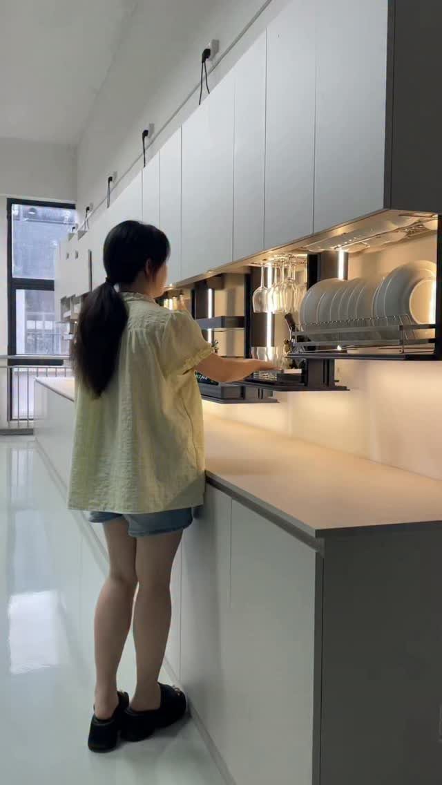
Minimalist cabinetry works when every element earns its place. Integrated lighting and a pull-down dish rack are not decoration; they replace tasks that normally clutter counters or require extra wall mounts.
I like this approach for small kitchens where visual quiet matters as much as storage volume.
The flat panel doors with no frame or bevel read cleaner, but they also show handprints and water spots faster than a shaker profile. If you cook daily, matte or textured finishes hide wear better than high-gloss.
Built-in lighting is worth wiring during install rather than adding battery strips later; the color temperature should match your overhead source or the cabinets will read yellow against cooler room light.
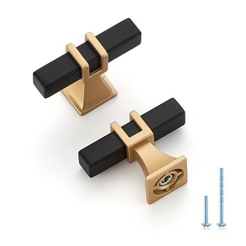
Dimensions:Overall length:2 inch(100mm);Diameter:1/2 inch(12mm);Projection:1-1/4 inch(32mm)

Asimerdeco after-sales service: No matter what problem you encounter, you can contact us via Amazon.com and we will try our best to solve it for you!

STYLE: Easily update your kitchen and bathroom cabinets or furniture with our casual cabinet hardware collection.
4. Nature-Inspired Cabinet Colors
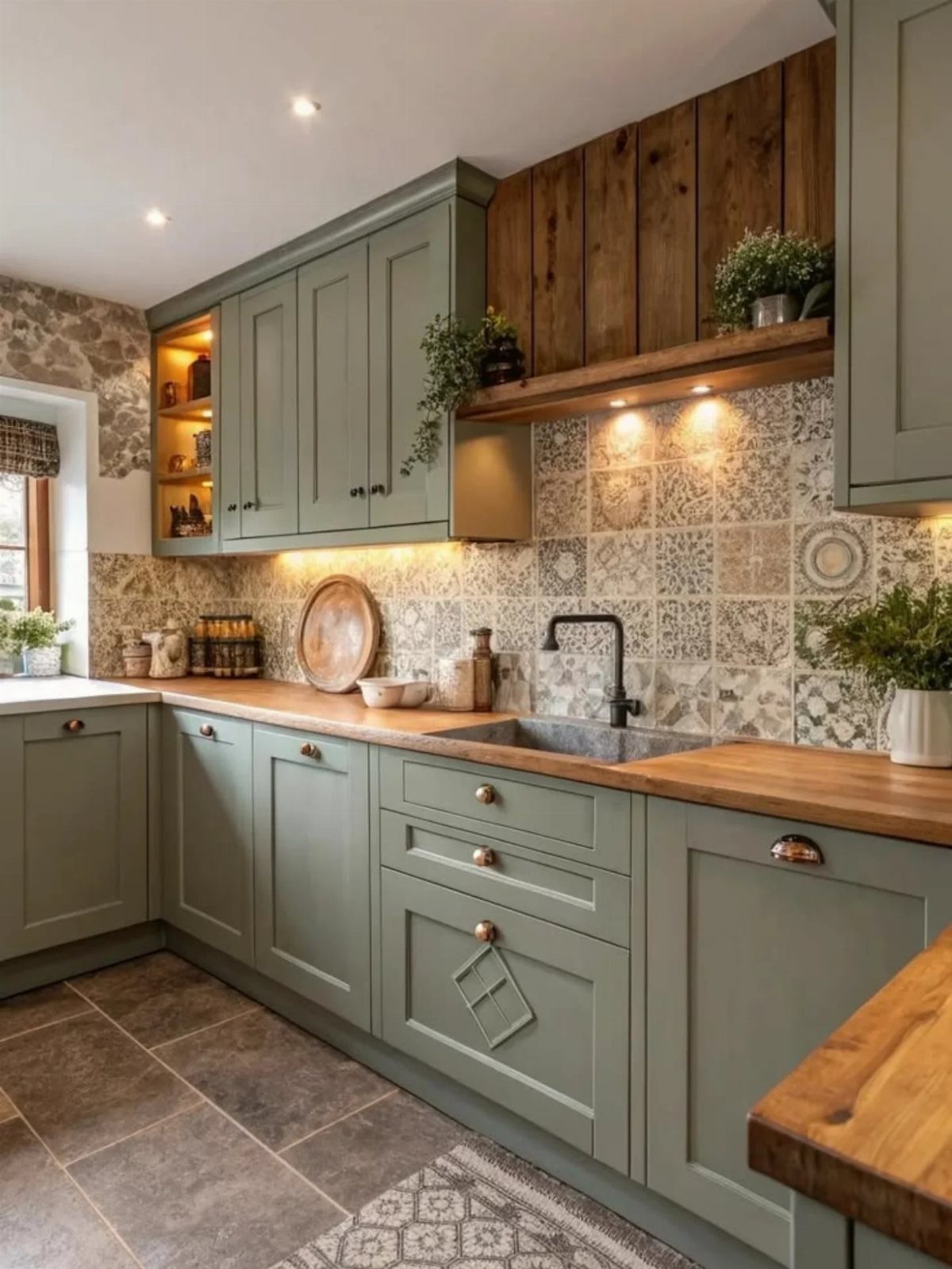
Sage green has become the default nature-inspired cabinet color for good reason.
It shifts with the light, reading gray in dim morning kitchens and greener as afternoon sun hits. Wood countertops and patterned tile keep the palette from feeling like a single-note paint choice.
I would use this combination in a kitchen with some natural light and existing wood tones in flooring or furniture. The rustic accent wall adds texture, but a simpler version skips it and lets the cabinets carry the color.
Nature-inspired hues work best when they reference something real outside your window: sage for gardens, slate blue for overcast skies, warm clay for dry terrain. Pick the one that belongs where you live.

【Pantry Cabinet with Pull-Out Shelves】This pantry cabinet features 2 pull-out doors, each designed with 4 shelves to create organized hidden storage. The slide-out structure offers easy access to stored items while helping keep your room tidy and uncluttered.

【Important Note】This kitchen cabinet organizer is designed for frameless cabinets only and will not fit cabinets with frames around the doors

Designed for Compact Spaces: Ideal for bottom-mounted pull-out shelves in coffee stations, under sink cabinets, narrow pantries, trash cabinets, bathroom vanities, RV storage, and other DIY pull-out shelf projects
5. Natural Wood Finishes
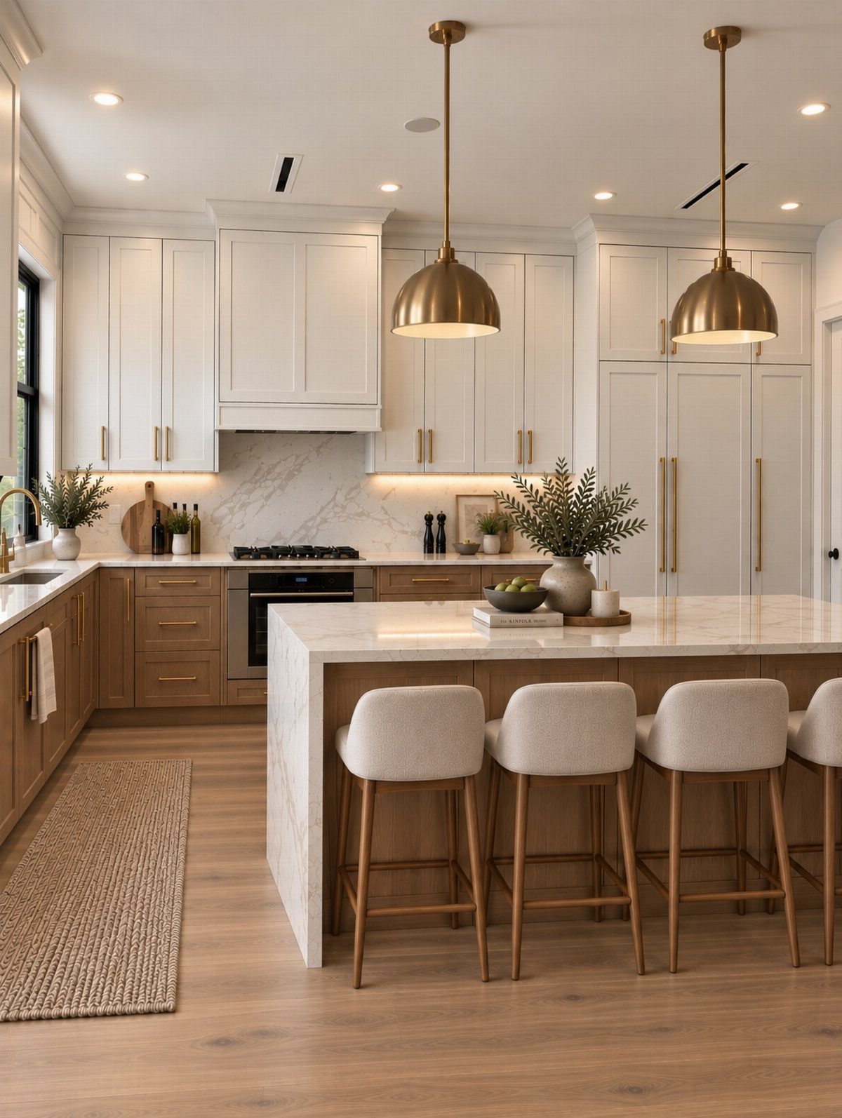
Natural wood lower cabinets with painted uppers balance warmth against brightness without the cost of full wood cabinetry.
For a budget version, I would use a mid-tone oak or ash below and a warm white above.
The wood species matters less than the finish: a clear seal or light oil keeps the grain visible and avoids the orange cast that cheap stains add.
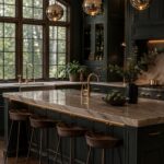
This combination also lets you replace or repaint the uppers later without touching the wood, which is harder to reverse. A row of stools suggests a social kitchen; if yours is smaller, the same proportion holds with fewer.

Premium High Definition Light - Choose daylight, a cool, bluish light, to illuminate your countertop with enhanced contrast and brightness for bolder colors. Unbercabinet lights for kitchen that provide 1000 lumens of brightness

Brilliant Illumination- Illuminate your space with an impressive 1380 lumens of 3000K radiant warm white light, perfect for enhancing visibility and creating a cozy ambiance while only using 18 watts of energy. Non-Dimmable.

Premium High Definition Light - Choose daylight, a cool, bluish light, to illuminate your countertop with enhanced contrast and brightness for bolder colors. Unbercabinet lights for kitchen that provide 1000 lumens of brightness
6. Creamy Tiles
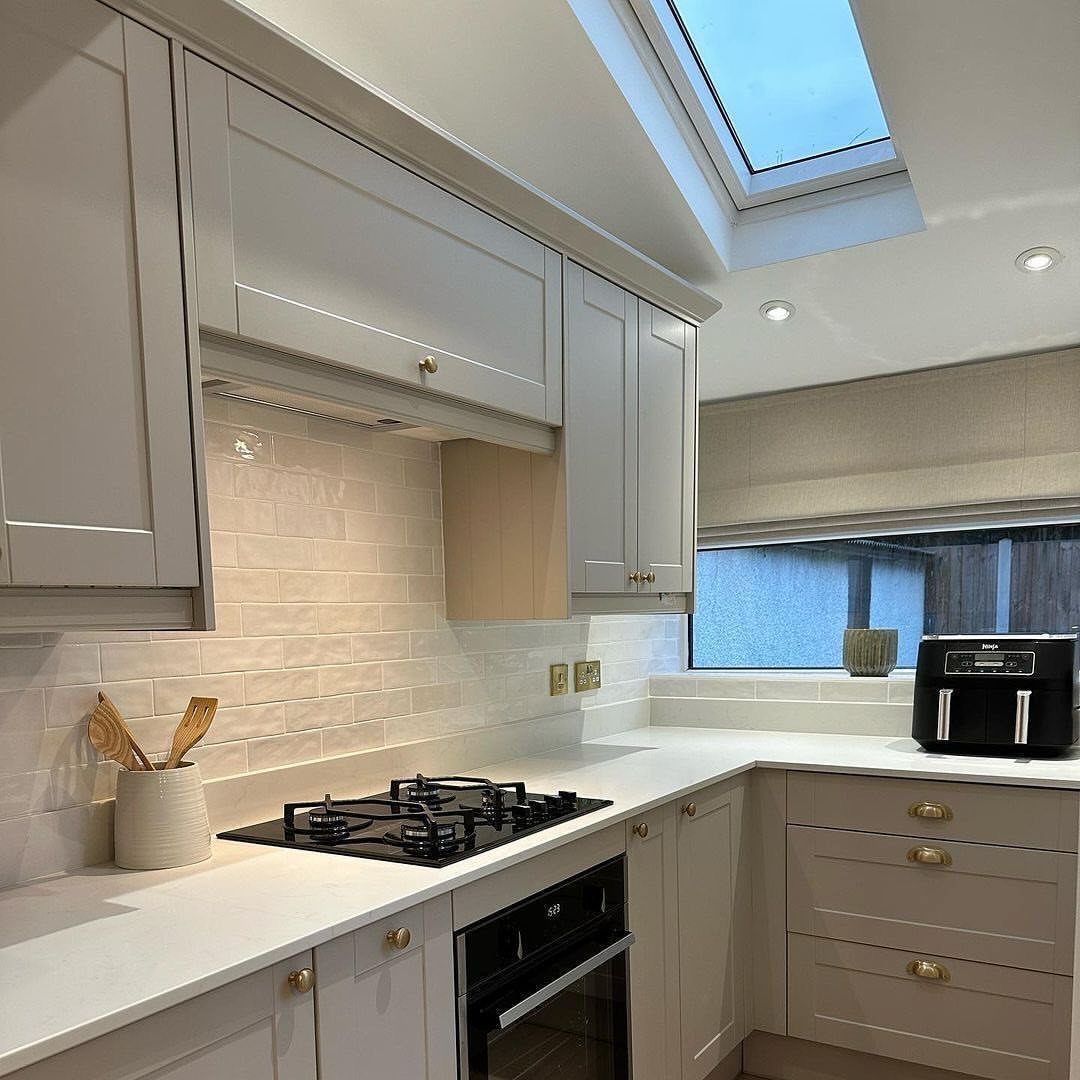
Creamy subway tile softens the clinical edge that bright white can bring to a kitchen with cool gray cabinets. The color shift would read even under artificial light, though natural light makes it warmer.
I specify creamy rather than stark white when the countertop has movement or veining that needs quiet backing. The difference is half a shade, not yellow; hold a sample against your cabinet and counter before ordering.
Standard subway tile in a smaller format keeps cost down and installation straightforward. A running bond pattern, offset by half a tile, is the classic choice and forgives slight wall irregularities better than a stack bond.
Grout color matters here: too light and the creamy tile looks dirty; too dark and the grid dominates. I usually match within one tone.

CABINET TRANSFORMATION: Refresh outdated cabinets, vanities, furniture and trim with rich Pure White color and a smooth semi-gloss finish

CABINET TRANSFORMATION: Refresh outdated cabinets, vanities, furniture and trim with rich Cadet Gray color and a smooth semi-gloss finish

All-in-One Formula: This furniture paint includes a built-in primer and top coat, providing seamless application on wood, metal, laminate, and more surfaces for a hassle-free painting experience.
7. Panel-Ready Kitchen Appliances
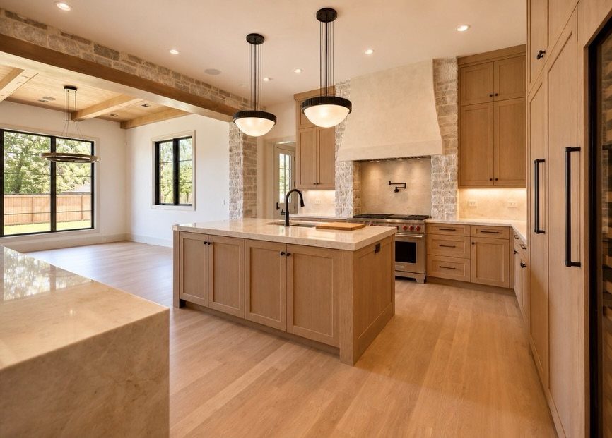
Panel-ready appliances let your dishwasher or refrigerator wear the same cabinet front as the rest of the kitchen, so the line of sight stays uninterrupted.
Light wood panels that match the island and perimeter cabinets exactly hide the appliances without the visual break of stainless steel.
I like this for galley kitchens and open plans where the appliance wall faces the living area.
Custom panels add weeks of lead time, and not every brand offers the right mounting hardware. If you are replacing appliances in an existing kitchen, measure the overlay carefully; a panel that sits too proud catches on adjacent drawers.

Customizable to Any Size: Our tempered glass can be cut to the size you need, whether it's for a small picture frame or a large tabletop. You won’t have to compromise on dimensions to get the perfect fit for any project, ensuring a seamless look and optimal functionality.

Standard Replacement Size: These 22" x 36" entry door glass inserts and frames feature an outer frame measuring 23 ¾" x 37 ¾" (+/-0.25") with 22" x 36" glass panel, designed to fit most entry doors with 1-3/4" thickness for easy replacement

【Available glass thickness】4-7mm, easy to install, use this hinge to insert the glass to create a freely rotatable glass door.
8. Statement Stone Surfaces
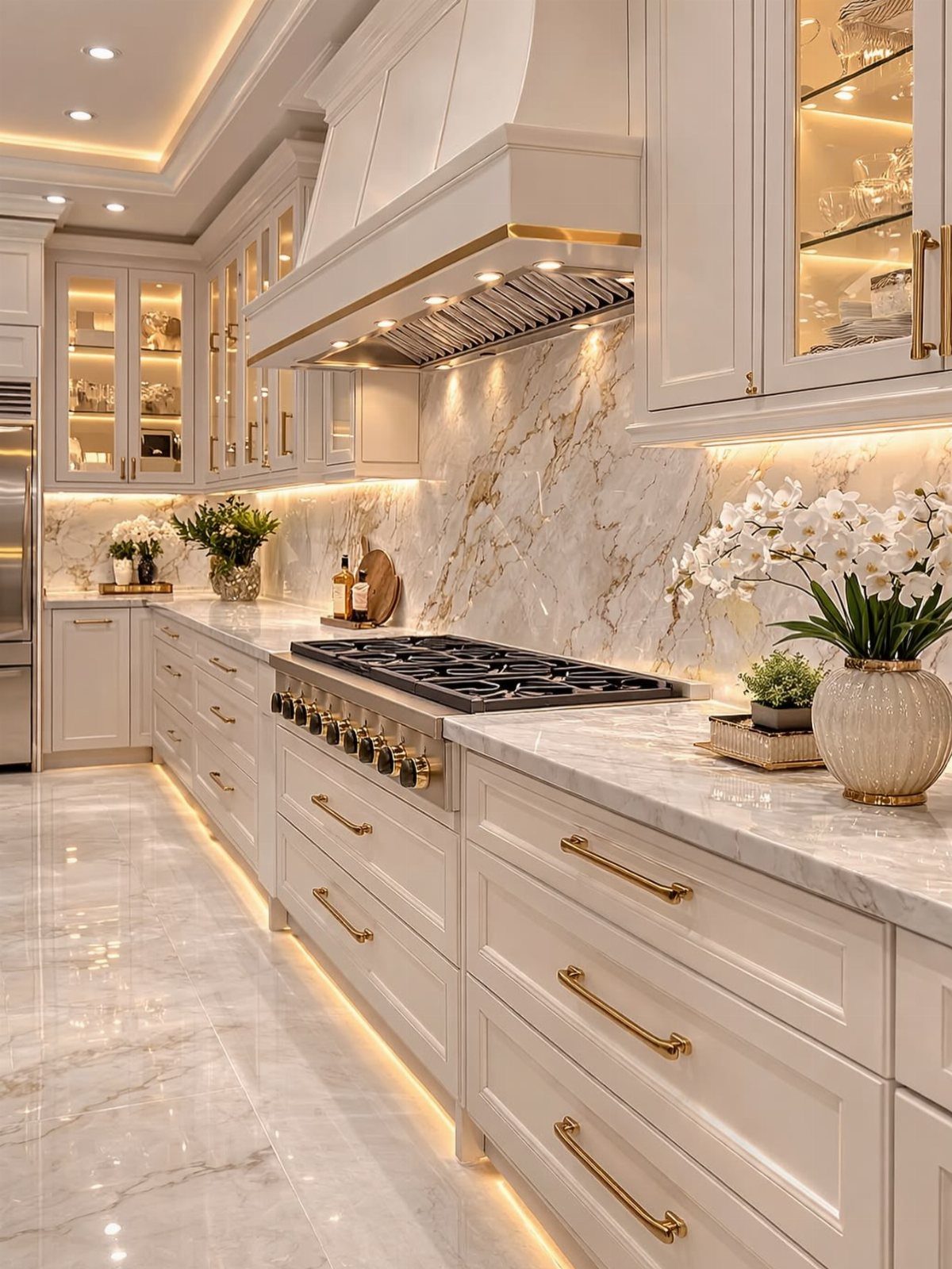
A single stone running from counter to backsplash to floor turns the kitchen into one continuous surface. The veining carries the eye across the room and removes the visual breaks that usually chop a kitchen into zones.
This is the opposite of a budget refresh. Full stone cladding means structural load checks, expert templating, and more material waste than most people expect on bookmatched slabs.
I would reserve it for a kitchen where the architecture already justifies the investment: high ceilings, generous light, and cabinetry quiet enough to let the stone speak.
For most first-home owners, a stone backsplash with a complementary quartz counter gives nearly the same effect at far less cost.

RASIYA ART KNOBS: Visit our storefront, by clicking on "Visit the Rasiya Art Store" below the title to have a glimpse of our collection

DURABLE AND STRONG: Cabinet pulls made of solid zinc alloy, handle is resists corrosion, dents, no flaking, no tarnish, no fingerprints. The gently curved back cradles fingers for a secure, comfortable grip every time.

Measurement:Top Diameter 1-1/4"(32mm); Base Diameter: 9/16"(14mm); Projection: 15/16"(24mm)
9. Open Shelving
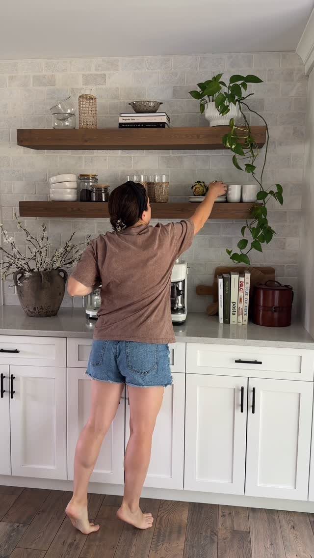
Open shelving trades cabinet volume for visual breathing room. Two floating wood shelves in a white kitchen hold daily dishes, a few plants, and books; everything else has to find another home.
I specify open shelving only when the client has a pantry or base cabinet run elsewhere to absorb the overflow.
Dust and grease settle on exposed dishes faster than people expect, so what sits out should be what you use weekly, not heirloom serveware.
The bracket choice matters: concealed floating hardware costs more than visible brackets but keeps the line clean. I would limit open shelving to one wall, never both sides of a cooktop where splatter is constant.

IMPORTANT NOTICE: Our cabinet pull out shelves are not suitable for cabinets with lips.Before ordering, please measure your cabinet dimensions correctly using the method shown in the picture.If your deep cabinet has a lip, please choose from our other drawers options designed for cabinets with a lip available in the store

Designed for Compact Spaces: Ideal for bottom-mounted pull-out shelves in coffee stations, under sink cabinets, narrow pantries, trash cabinets, bathroom vanities, RV storage, and other DIY pull-out shelf projects

【Important Note】This kitchen cabinet organizer is designed for frameless cabinets only and will not fit cabinets with frames around the doors
10. Mixing Wood with Metal
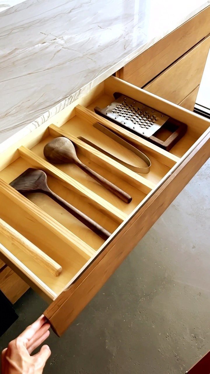
I would extend this to hardware and fixtures: brass pulls on walnut cabinets, or a blackened steel pendant over an oak island.
The maker of this drawer kept only what they used most nights, which is the discipline open storage demands.
Too many mixed materials read busy; I stop at two dominant finishes and let one carry the weight. Warm wood plus aged brass suits traditional kitchens; rift-sawn oak with matte black reads more contemporary.
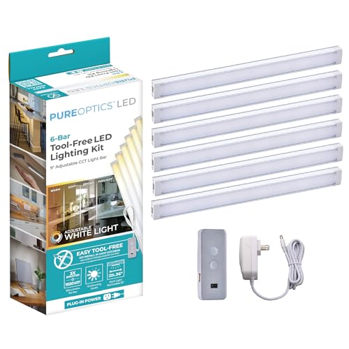
SLEEK DESIGN: Ultra-slim, modern design provides maximum illumination at a minimum footprint

💡Great Brightness-- Very bright nicely diffused light, no led dots of light showing on your countertops, the light bar has 33LEDs, covering a wide range. The color is best for detailed work and kitchen cooking.

Warm White and Daylight White : Dimmable Under Cabinet Lights Plug-in LED Strip Lights for kitchen, 6 PCS pre-cut LED lights strip. White cabinet light Suitable for DIY your kitchen, cabinet, closet, counter, shelf, TV back, showcase and anywhere you want
11. Bold Blue Interior
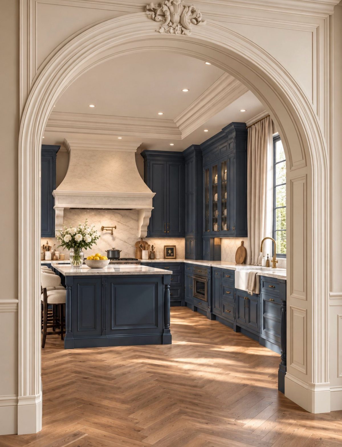
Navy cabinets and island with white marble surfaces make a statement that still reads classic rather than trendy. The herringbone floor adds pattern without competing for attention.
This much saturated color needs careful light.
A south-facing kitchen can handle it; a dim interior room will feel like a cave. I would balance the blue with warm brass or aged bronze hardware rather than cool chrome, which fights the warmth of the wood floor.
For renters, this is not a practical DIY; the commitment is too deep and the reversal too expensive. A safer test is a blue island with white perimeter cabinets, which gives the effect without the risk.
12. Contemporary Kitchen Glass Details
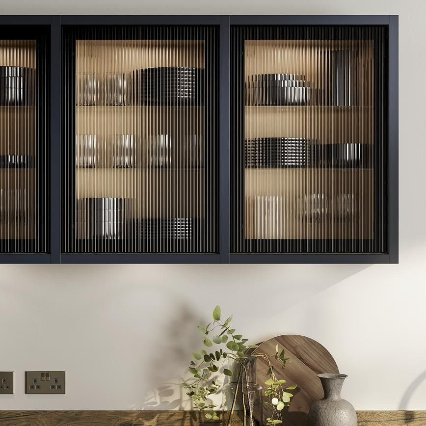
Fluted glass in cabinet doors adds texture you can see through without full exposure. The ribbing distorts what sits behind just enough to hide clutter, while interior lighting turns the cabinet into a lantern at night.
Black frames against the fluted glass read more graphic than clear glass in metal; I would use this where the kitchen already has strong lines and the cabinet can hold its own as a focal point.
The glass is harder to clean than flat panels, and the flutes collect kitchen grease if placed too near the cooktop.
For a lower-commitment version, a single upper cabinet with fluted glass over a coffee station gives the detail without dominating the room.
13. Two-Toned Kitchen
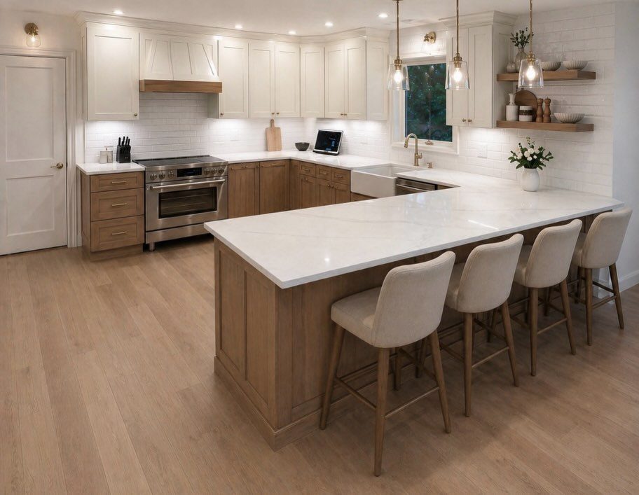
Two-toned kitchens split color by height: white uppers keep the ceiling feeling high, while wood lowers ground the room and hide scuffs where traffic is heaviest.
Stock cabinets from any big-box store handle this combination fine; custom work is not required for the effect.
I would match the island to the lower tone, not the upper, which keeps the visual weight at the floor where it belongs.
A third neutral, like beige or warm gray, bridges the 2 tones without adding another color to the palette.
14. Stainless Steel Accents
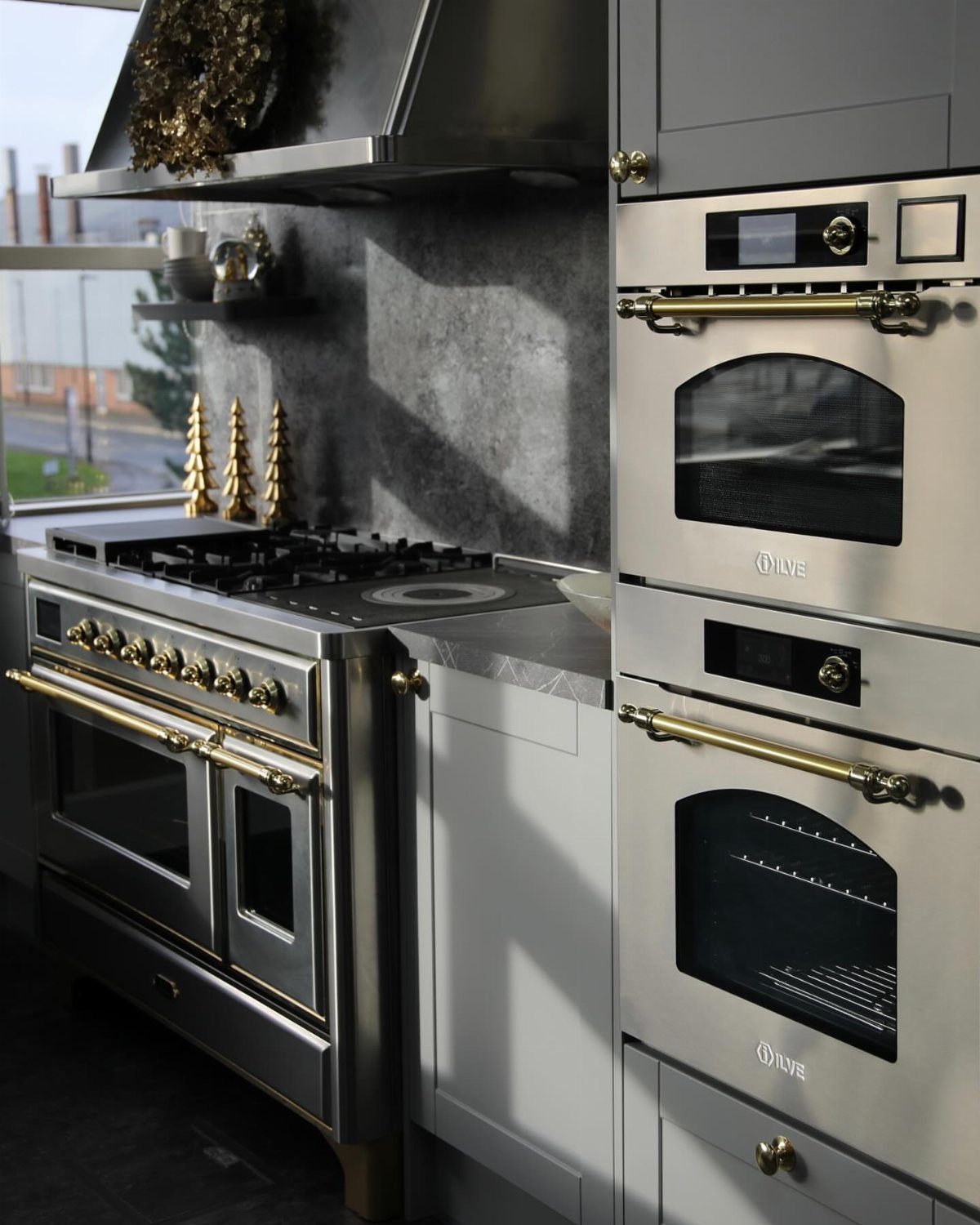
Stainless steel appliances with gold hardware bridge industrial and warm in a way plain stainless cannot. The gold handles on this range read as deliberate, not accidental, because they repeat elsewhere in the room.
For a kitchen already committed to cool gray cabinets, this is an easier update than replacing cabinetry. I would add one more gold element, a faucet or pendant, so the handles do not sit alone.
Full stainless wall ovens cost more than a standard range but give serious cooks the capacity that holidays demand. Both finishes show fingerprints, so a microfiber cloth kept nearby handles the cleaning.
15. Curved Countertops and Islands
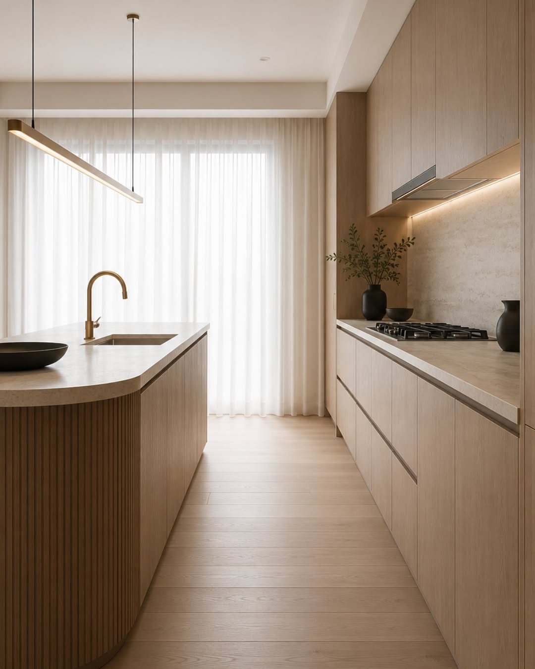
A curved island softens the boxy geometry that dominates most kitchens. The radius needs space to breathe; in a galley layout the curve would fight the walls instead of flowing past them.
This shape works best in an open plan where the island is approached from several angles.
I would keep the countertop material simple, letting the edge profile carry the interest. A curved faucet in brass or gold repeats the line and keeps the gesture consistent across the whole island.
Fabrication runs higher than a standard rectangle because the stone or wood must be cut and finished on a radius, and waste increases.
For a lower-cost test, a curved bar top on a standard rectangular base gives some of the feel without full commitment.
Emphasis on Functionality
Kitchens in 2026 are built for more than cooking, and the shift shows in how space gets planned.
A kitchen that responds to real life needs flexible layout: island seating that works for homework and for guests, storage that reconfigures without a full remodel, and surfaces that handle both prep and display.
The "museum exhibit" kitchen is fading. What replaces it is a room people actually sit in.
A small lamp on a counter, cookbooks stacked where they can be reached, a tray that corrals daily clutter: these details ground the space and make it feel occupied rather than staged.
Natural materials help. Marble with real veining, wood with visible grain, and a fireplace if the architecture allows all pull people toward the room at hours when no one is cooking.
The challenge in larger homes is keeping that coziness when ceilings run high and windows dominate the wall.
Lowering the visual center with a substantial island, a sculptural hood, or a heavily textured backsplash brings the room back to human scale.
So far, 2026 is proving to be the year of disconnection – not from people, but from technology. And kitchen trends have seen the strongest shift, with homeowners gravitating away from high-tech features towards a more analogue way of living.
Sustainability Expectations
Sustainability in 2026 is not a selling point; it is assumed. The practical question is how to get there without stripping the kitchen to studs.
A cabinet refresh, reusing existing boxes while replacing doors, drawer fronts, and hardware, cuts material waste sharply against a full teardown. The timeline shrinks too, often from weeks to days.
Homeowners I work with notice 3 things: less disruption, less landfill, and less money out of pocket. The environmental benefit is real but invisible; what they see is a functional kitchen faster.
For a first-home owner or renter who might sell or remodel later, this approach keeps your options open without locking in costs you can’t get back. The limitation is structural.
If cabinet boxes are water-damaged, out of level, or laid out badly, new doors cannot fix what is underneath. I inspect the carcasses first: plywood boxes in standard sizes are worth keeping; particleboard swollen at the sink base is not.
Personalization in Design
A kitchen that reflects how you live starts with an honest read of your actual habits, not the ones you aspire to.
The stylized corner, a small lamp and stacked cookbooks on a tray, works only if you will maintain it; otherwise it becomes clutter that shames you daily.
Smarter layouts in 2026 mean storage built for what you own, not generic cabinets sized to industry standard.
Deep drawers for pots, vertical dividers for trays, and pull-outs that fit your spice collection beat rows of doors that hide disarray. Warm materials, natural wood and stone with variation, age better than surfaces that demand perfection.
Flexible features, a movable island, a table that expands, a workstation that converts, let the room shift from weekday breakfast to weekend gathering without a renovation.
The risk in personalization is overcommitting to a moment in your life that passes.
I would keep the expensive fixed elements, cabinets, counters, appliances, in materials that tolerate change, and put the personality into what is easier to swap: hardware, lighting, textiles, and the objects that sit on open shelves.
Frequently Asked Questions
What are the trendy kitchen design trends for 2026?
Warm neutrals, natural wood finishes, and hidden pantries lead the list. Flat-panel cabinets stay quiet visually, and adding integrated lighting with pull-down racks inside keeps small kitchens from feeling busy where every inch counts.
A 2026 Houzz study put wood cabinetry ahead of white for the first time in years, with pantry cabinets and smarter layouts topping the list of what people actually change in a renovation.
What popular kitchen trend is dying right now?
The all-white kitchen and the museum-exhibit kitchen are both fading.
What moves in instead is a kitchen someone lives in: cookbooks within arm’s reach, a tray that collects the daily mess, and surfaces that work for chopping vegetables or setting down a coffee cup.
Overdone single-statement color schemes are also losing ground to more layered approaches that mix warm walls with moody cabinets rather than drowning every surface in one trending tone.