The ideas below run from a $15 can of chalkboard paint to built-in millwork that demands a contractor, so the deciding factor is how permanent your situation is and how much wall you are willing to alter.
Hanging height at seated eye level matters more in a dining room than in any other space where guests stay put for an hour or more.
1. Plate Display
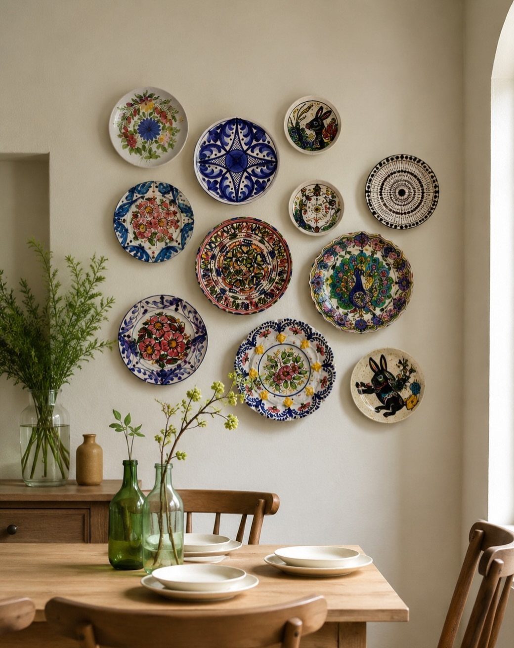
A plate wall turns collections into something you actually live with instead of storing. I like starting with one anchor piece, usually the largest or most patterned, and building outward in a loose cluster rather than a grid.
A mix of ceramic plates with hand-painted detail works because the palette stays tight: blues, warm whites, and the wood tone of the table below.
For renters, plate hangers with spring wire grip the rim without adhesive and leave barely a pinhole. Paper plates or lightweight melamine won’t hold; stick to stoneware or porcelain with some heft.

Multi-Purpose Decorative Set - This 4-piece set of handmade Turkish ceramic plates serves as both beautiful wall décor and elegant tabletop accents, while doubling as functional jewelry dishes for rings, earrings, and delicate necklaces.

WHAT YOU WILL GET: Our package includes 20 functional hooks for hanging pictures, decorative plates, photo frames and art. Large amount is enough for your daily usage and replacement, you can also share these wall plate hangers with your families and friends.

Complete 5 Piece Wall Art Set: this Holland wall sculpture is a complete set of 5 rose red and white ceramic plates; The collection includes 1 pcs 10.5 inch plate, 3 pcs 8 inch plates, and 1 pcs 6 inch plate for a varied display; Each piece in this vintage rose red and white plates set shows a nice pattern, from florals to scenic designs; With protective packaging, they are ready to create a coordinated rose red and white wall ornament arrangement right away
2. Sculptural Art
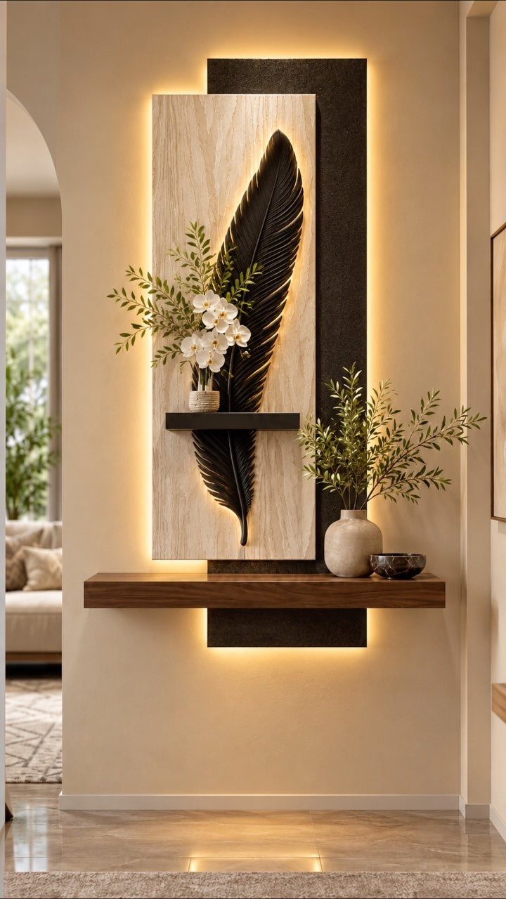
Sculptural art does what flat canvas cannot: it casts shadow and shifts as you move through the room. A feather piece reads as drawing from one angle, object from another, which keeps a dining wall alive during long meals.
I tend toward single large pieces over clusters for dining rooms; the table already holds competing shapes, and the wall needs to settle the space, not add more noise.
Wood backing with integrated lighting solves a problem I run into often: dining rooms with no overhead wiring for art. Battery LED strips behind the relief give it presence after dark without an electrician.
Dining rooms are a fantastic space to make a statement with framed artwork, creating a focal point or conversation piece in a room.

3 Vintage Colors: you will receive 3 pieces of metal feather decors in 3 different colors, retro white, turquoise, old copper respectively, which are enough for you to decorate your rooms as a combination, or you can hang them individually on different places

GALLERY WRAP: Our gallery wrapped canvas prints are made of high quality cotton poly blended canvas, printed to perfection, and stretched over a 1.5" depth solid wooden frame. It comes with included hanging hardware making the print art easy to mount.

Amount of Packaging: what you will receive are 4 pieces of wooden feather wall decor set, which could be applied separately or put together as a whole; Sufficient quantities and various types could meet your daily decorating needs and bring your home decoration more harmonious beauty
3. Minimalist Black-and-White Prints
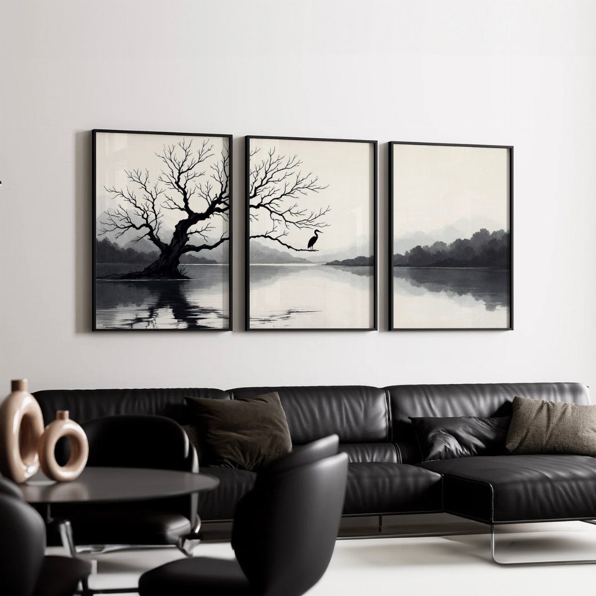
3 matching prints in simple frames, hung level with the top of the sofa back, give a dining area order without trying too hard.
Black-and-white specifically lets you change the table setting, flowers, or chairs underneath without clashing; I have seen rooms where the art fights a red runner or blue glasses every season.
The landscape subject, tree and water, reads calm at table height where abstraction can feel restless. I print on matte paper for dining spaces; gloss catches candlelight and becomes a mirror.

Machine Washable & Water Repellent Surface:Easy to Clean, Pet Friendly, Spill Resistant, Laundry Room Keep your home pristine with our Machine Washable Area Rug. Featuring a water resistence surface, it’s a pet friendly and kid friendly solution for high traffic areas. Ideal for the kitchen or entryway where spills happen.

Vintage Kitchen Wall Decor: This black and white dining wall art features a timeless black and white design with modern minimalist styling and classic striped elements. Blending clean lines with vintage-inspired aesthetics, this artwork creates an elegant statement piece that complements a variety of kitchen and dining spaces

Soft Material : Invite this gorgeous leopard rug into your home and step into softness; Its texture is oh-so-welcoming underfoot; Made of sturdy synthetics, this rug holds up exceptionally well to foot traffic and hours of play
4. Floating Shelves
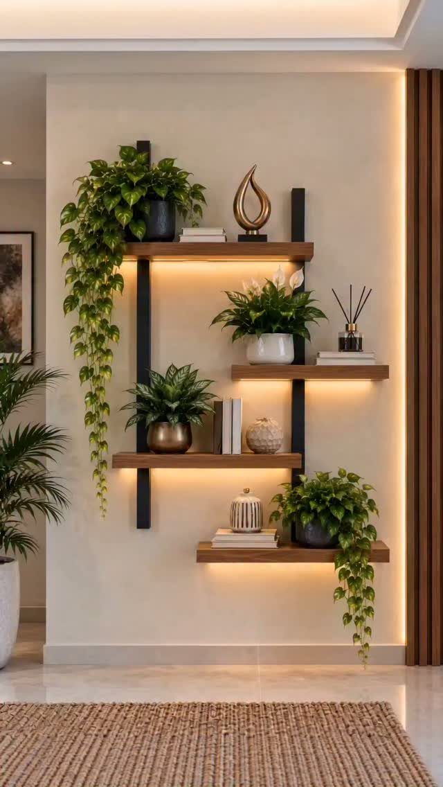
Floating shelves with hidden brackets keep the line clean and let you swap objects as the year turns.
Black hardware and under-shelf lighting give even plain objects presence; I specify warm strips, not daylight, since nobody looks good eating under blue-tinted light.
Plants, books, and small objects together need a rule or they look like clutter.
My preference: one living thing, one stack, one object with height on each shelf. For renters, floating shelf systems with keyhole mounts leave smaller holes than bracket arms and hold a reasonable load if you hit the stud.

VERSATILE FLOATING SHELVES: Make full use of your empty walls to create storage space for decorations and household items. Mount the wall shelves above a desk, fireplace, entryway, vanity, or between windows to add functionality.

100% Paulownia Wood: Elevate your space with AMADA rustic floating shelves for wall, crafted from 100% Paulownia wood sourced from 5-year-old trees. The natural wood texture of floating shelves is timeless and can blend in well with any decor style.

Sleek Floating Design: Elevate your style with AMADA’s floating shelves, ideal for living rooms, bedrooms, or office spaces. Designed with modern, minimalist sophistication, the concealed brackets of our wall shelves help to maximize wall space for a seamless, streamlined look.
5. Chalkboard Wall
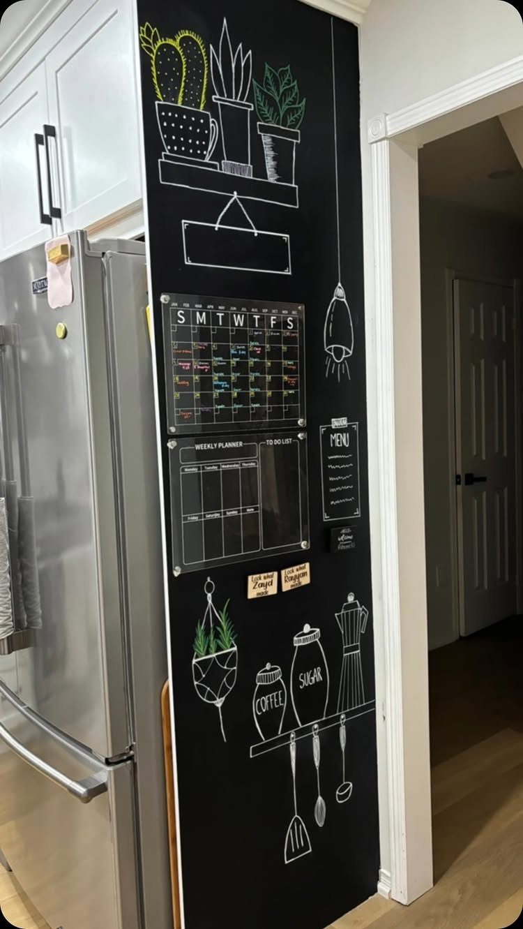
Chalkboard paint turns the wall beside a dining nook into a working surface: menu, grocery list, the week’s schedule where everyone sees it.
I use latex chalkboard paint, 2 coats over primer, and condition the surface by rubbing chalk over the whole thing once, then erasing. Otherwise the first marks ghost forever.
Dust is real; I keep a microfiber cloth nearby and accept that this wall needs more maintenance than most. For a cleaner look, chalk markers wipe with water but leave faint residue over time.

No damaging hooks, springs, clips or wires

【Package Includes】: Our package comes with 10 invisible adhesive plate hangers, perfect for displaying decorative plates, photo frames, and artwork. The ample quantity meets your daily hanging and replacement needs — you can even share them with family and friends for home decoration projects.

6. Framed Textiles or Tapestries
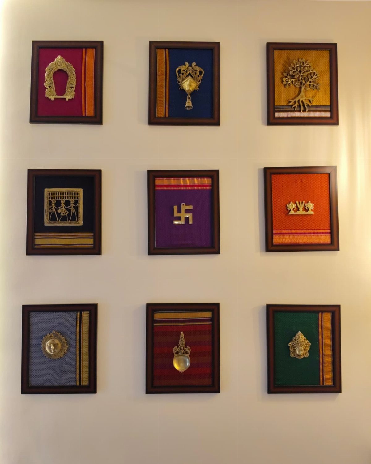
Small framed textiles grid together like a single piece, but the fabric gives the wall softness that paint or print cannot.
Gold metallic in textile pieces catches light across the dining table; in a room with a fixture overhead, that shimmer moves as people pass.
I stretch textile over acid-free mat board, pin at the back, then frame without glass. Glass flattens the weave and creates reflections; the point of fabric is its texture.
For a grid of small squares with slim frames and narrow spacing, the whole assembly stays compact, which suits the wall above a four-chair table without dominating.

Made for 7" - 10" Diameter Plates (NOTE: If your plate is deep or thick we recommend buying a size up to ensure proper fit)

Plate Wall Decor Complete Set: 4 pcs French relief flower ceramics plates include hydrangea, lily, rose, tulip, 8 pcs invisible W‑type plate hangers in stainless steel with nails; Create a cohesive floral wall sculpture that blends artistry and practical hanging, perfect for home or bedroom

【 Material】Our decoration is made of ceramic material, which is strong and durable, with a smooth surface and will not cut your hands.
7. Architectural Molding
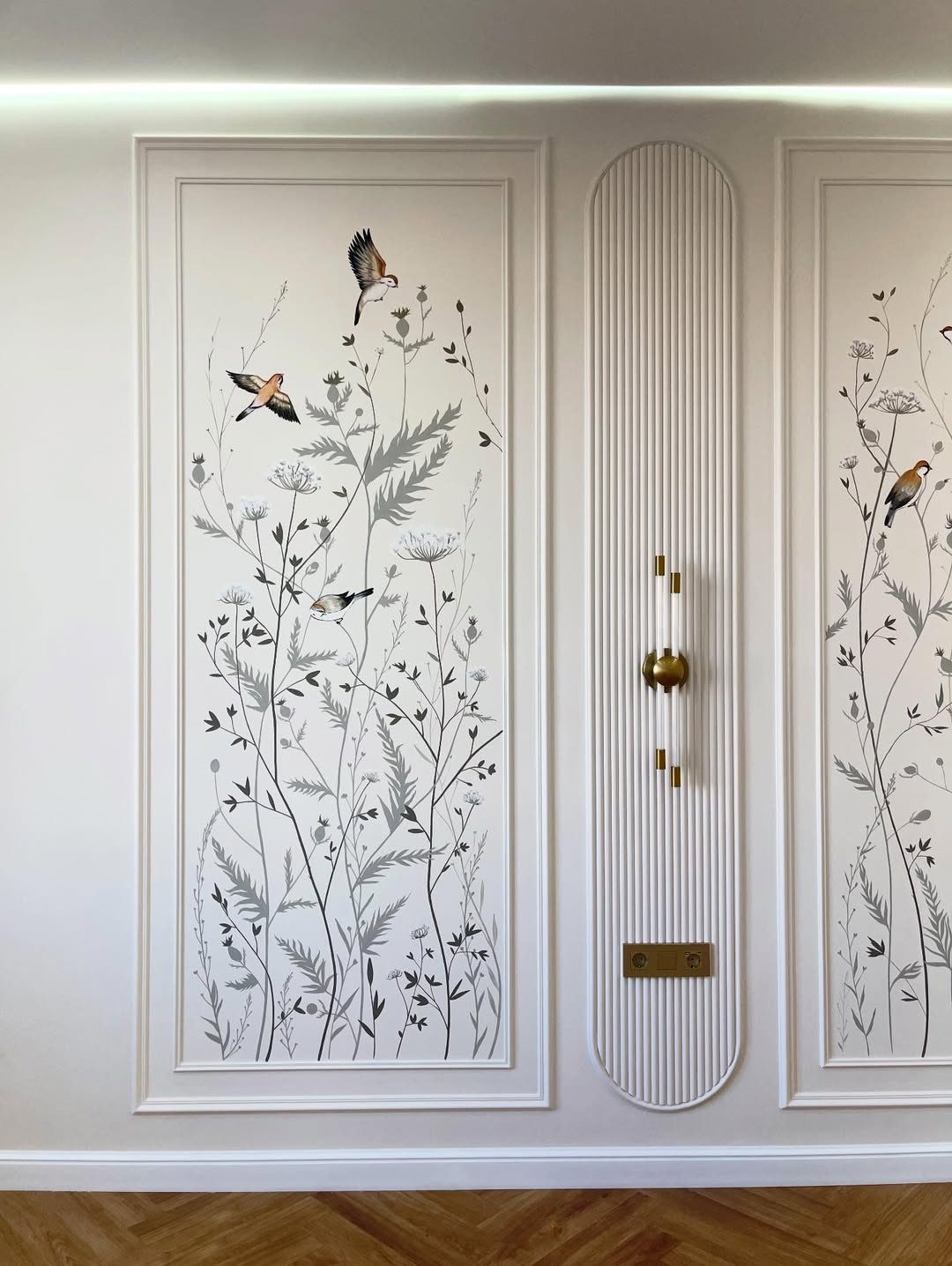
Molding frames the wall itself as architecture instead of hanging something on it.
Rectangular panels with simple cap molding inside create rhythm without competing with whatever sits within them. Botanical prints slip into the panels and read as built-in, not added-on.
I paint molding the same color as the wall when I want quiet structure, or in a tone slightly deeper for shadow line.
Molding that wraps corners can carry light fixtures into the whole composition, so the wall reads as one intentional shape instead of separate pieces.
Installation is straightforward if you rent a miter saw for a morning; adhesive molding exists but I do not trust it in dining rooms where heat and humidity cycle daily.

Balanced Three-Piece Display: One large, one medium and one small feather create a complete focal point for living rooms, bedrooms, entryways, dining areas, home offices or staircase walls

Vintage Style:This vintage-inspired wall sculpture is the perfect addition to your home décor. The intricate wing and feather details of the swallow bird create an eye-catching focal point, making it an excellent piece for your living room, bedroom, or any other room in your home.

【Wall Art Size】: This artwork wall decor measures approx 20x40 inches(50cmx100cm) please note that the images are shown for illustrative purposes only, please measure your wall correctly and make sure you choose the right size.
8. Gallery Wall
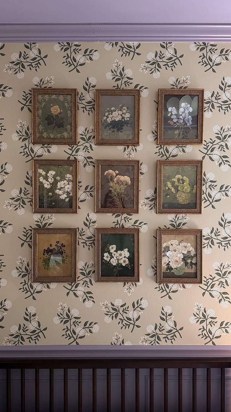
A grid of 9 matching frames turns busy wallpaper into deliberate pattern instead of chaos.
The frames repeat the same size and spacing so the eye reads the collection as one unit; the botanical prints inside pick up colors already in the paper beneath.
I keep the frame profile slim, under one inch, and use a mat with generous border so the print floats. Hanging a grid demands patience: I cut paper templates first and live with them for a day before driving nails.
For renters, Command strips rated for the frame weight work on smooth wallpaper but fail on textured or vinyl-coated paper; test one corner.

Fine Canvas Build:The canvas artwork is made of thick canvas and solid wood frame with a frame thickness of 0.6 inches. The special surface treatment keeps colors vivid for a long time. The robust canvas material delivers excellent sturdy. Adopting high-definition giclee printing on premium canvas, it presents fine print effect.The canvas print brings warm charm to your space and keeps an elegant appearance for years to come.

SPOIL YOURSELF - Memory foam is the leading fill type for any comfortable cushion out there. Whether it's a pillow, mattress topper, bed rest, or chair cushion, everyone knows that memory foam is the leader in comfortable materials. Over the years we have experimented different constructions and listened to your feedback and created a chair pad that is so soft and pleasant; a must have for all of your chairs.

Vintage Botanical Wall Art Set:Bring classic farmhouse charm to your space with a set of 4 botanical wall art prints featuring black and white floral illustrations, rustic plaid borders, and a timeless vintage-inspired look.
9. 3D Wall Panels
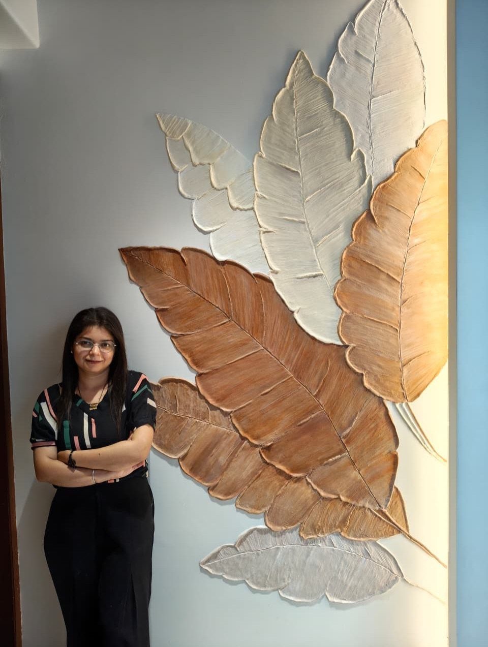
Three-dimensional panels turn a flat wall into relief that shifts as light moves across it. The stylized leaves here catch morning and evening sun differently, which matters in a room used mainly at those hours.
I install these over a primed wall with construction adhesive and a few finish nails; the panels themselves hide the fasteners. Paint after installation, not before, or the seams telegraph.
Lightweight polyurethane versions suit DIY handling; plaster or resin needs professional help and wall reinforcement. The trade is cleaning: dust settles in the crevices, and a vacuum brush attachment is the only tool that reaches.

Sleek Floating Design: Elevate your style with AMADA’s floating shelves, ideal for living rooms, bedrooms, or office spaces. Designed with modern, minimalist sophistication, the concealed brackets of our wall shelves help to maximize wall space for a seamless, streamlined look.

Stylish & Safe: Upgrade your home decor with our Security MDF floating wall shelves. With a sleek and detailed surface treatment, our floating shelves provide a sophisticated look that is both exquisite and comfortable for you and your family

✓ HIGH-QUALITY METAL MATERIALS: Our shelf support is made of thick and heavy duty iron materials.Features a thick black matte surface coating that delivers enhanced water resistance and effective anti‑rust performance for long‑term daily use.
10. Wall Sconces
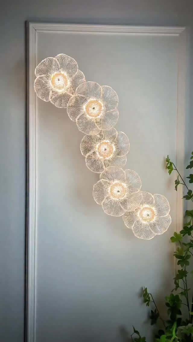
A diagonal arrangement of sconces makes the wall an event instead of a background. The flower-shaped wire forms read as drawing by day, lanterns by night, which gives a dining room 2 characters without changing anything.
I wire sconces to a dimmer; full brightness flattens the shape, but low light lets the glow pool and the wire silhouette emerge.
Battery-operated LED versions with remote dimmers suit renters and walls without junction boxes. Even spacing is what makes a diagonal arrangement work; a straight line would feel institutional, random placement would feel restless.

High Quality: Our plate hangers for the wall are made of premium material. The metal D-shaped hook of the plate hanger is anti-rust and not easy to deform


【Wide Applications】: Our plate hangers for the wall are perfect for displaying your antique plates, art plates, vintage plates, or ceramic plates. These plate hangers are ideal for showcasing them on the wall. The plate hangers for the wall provide a secure display solution for your precious collection.
11. Wall-mounted Plants
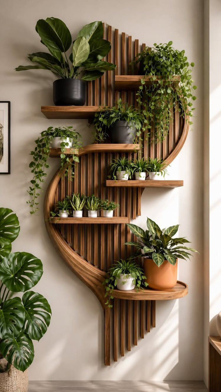
A wall-mounted shelf with vertical slats and curved edges turns plants into living sculpture. Slats let air circulate, which keeps mold off the wall behind; a curved frame softens the geometry of most dining rooms.
I choose plants that tolerate the light actually available: pothos and philodendron for low north light, ferns for east windows, succulents only if the wall faces south and the shelf sits in direct sun. Watering is the practical limit.
A tray beneath each pot helps, or accept that the shelf comes down twice a year for scrubbing. For weight, hit studs or use toggle bolts; moist soil is heavy.
12. Large Statement Mirror
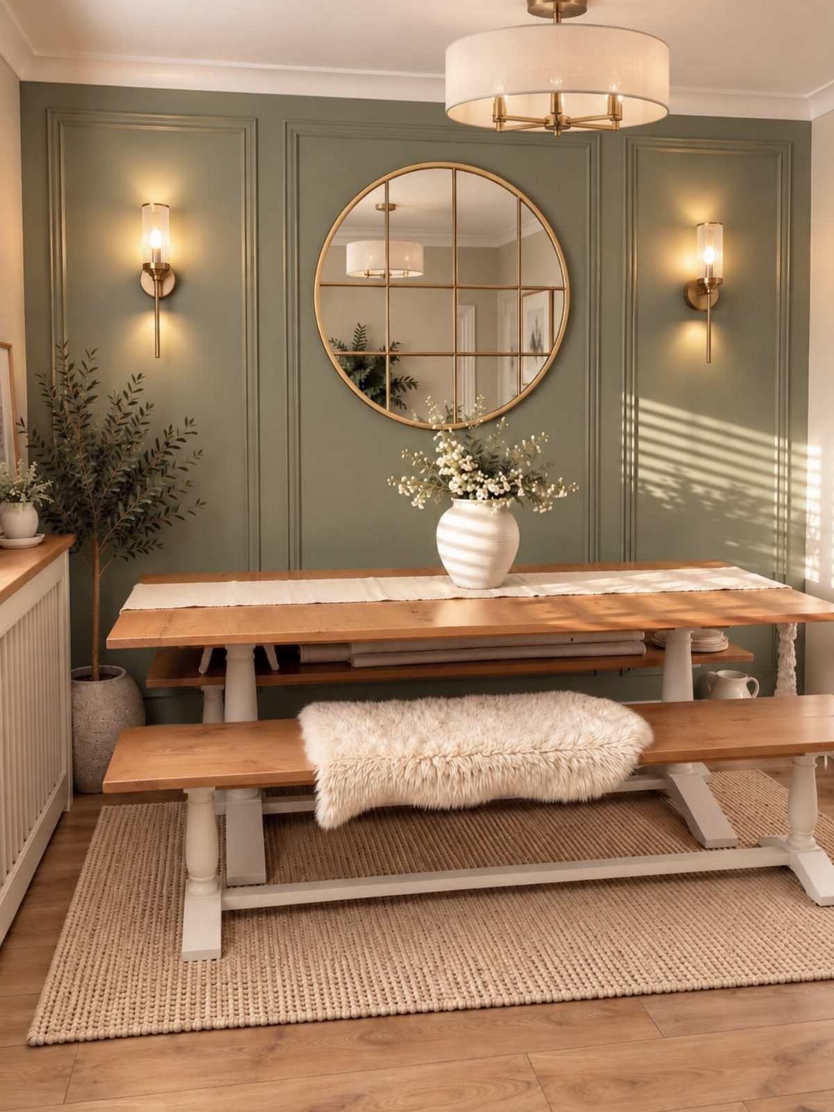
A single large mirror above the table doubles the room without doubling the square footage. The gold frame here picks up the sconce finishes and warms the sage panels; a black or silver frame would read colder against that green.
I hang the center of a dining room mirror at standing eye level, which lets seated guests see light reflected, not themselves eating.
Round shapes soften the rectangle of most tables; the curve repeats in plates and glasses below. For renters, a leaner mirror on a narrow shelf against the wall achieves nearly the same effect without hardware.
13. Framed Oversized Statement Painting
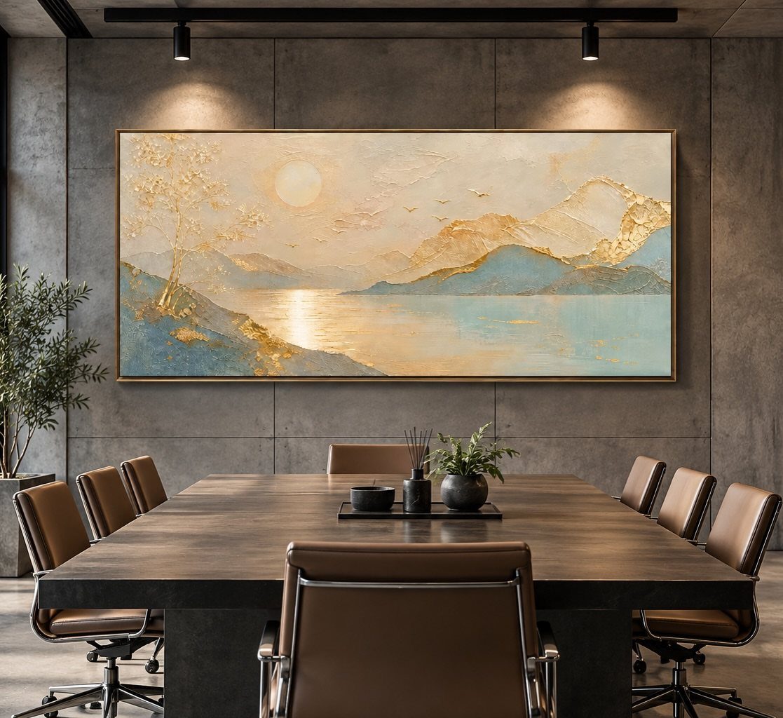
A single horizontal painting at table width turns the whole wall into a view. Concrete or plaster behind it keeps the focus on the image; busy wallpaper would fight for attention.
I look for landscapes with a horizon line near the middle, which sits at seated eye level and gives everyone at the table something to rest on.
The frame here is thin gilt, barely there, which lets the painting breathe against the raw wall. For renters, a large canvas on a picture ledge leans instead of hanging and leaves no mark.
14. Grid of Framed Mirrors
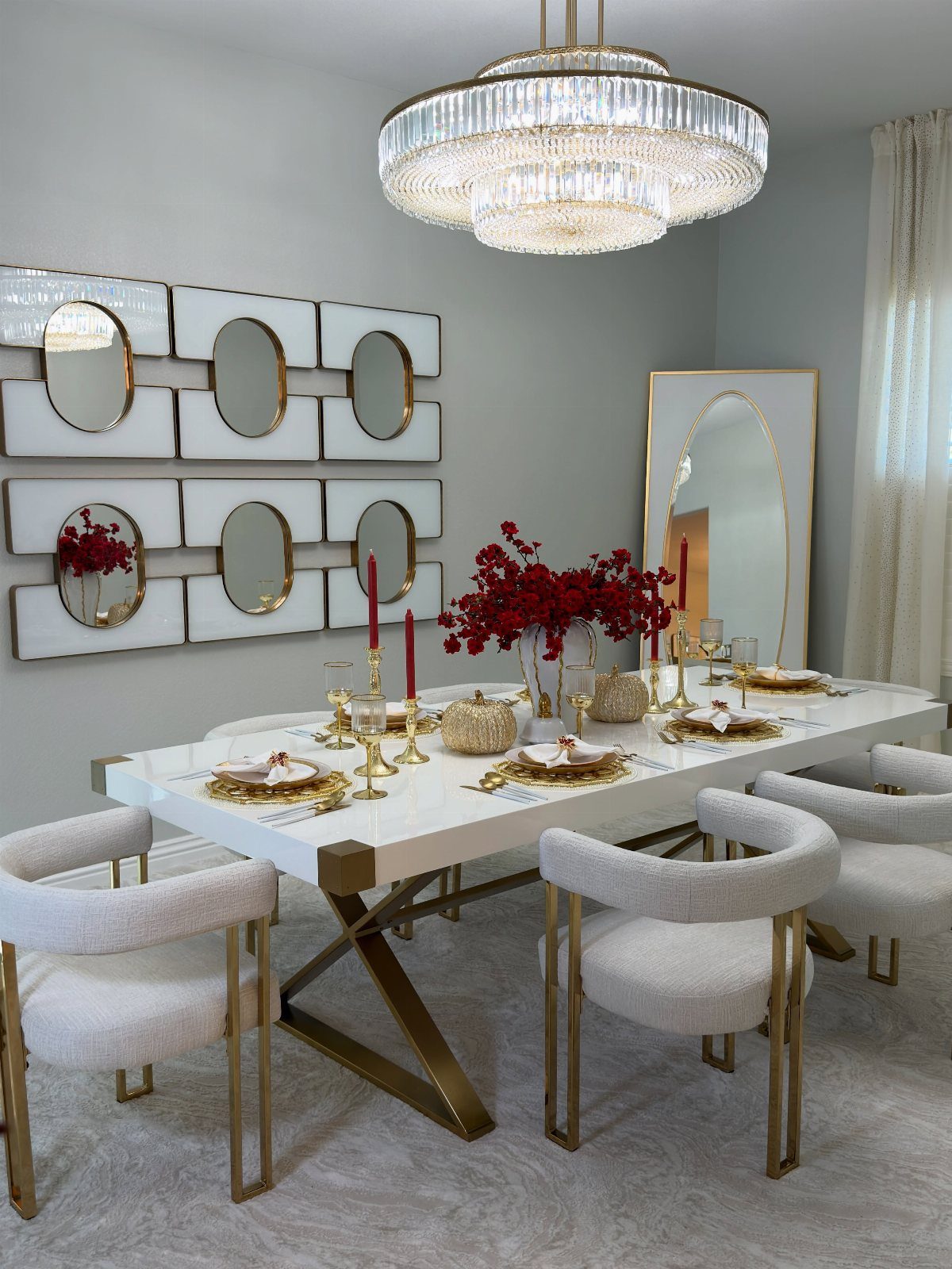
Matching frames in a grid multiply light without adding color that competes with the table. Oval mirrors inside rectangular frames give each unit 2 shapes to read, which keeps the arrangement from feeling rigid.
I center the grid on the table, not the wall, so the reflection picks up the chandelier and the place settings below.
White and gold suits rooms that already run pale; in a darker dining room I would swap to black frames and antiqued glass. For installation, a paper template and a laser level save the grief of uneven spacing.
15. Vertical Wood Slat Wall Accent
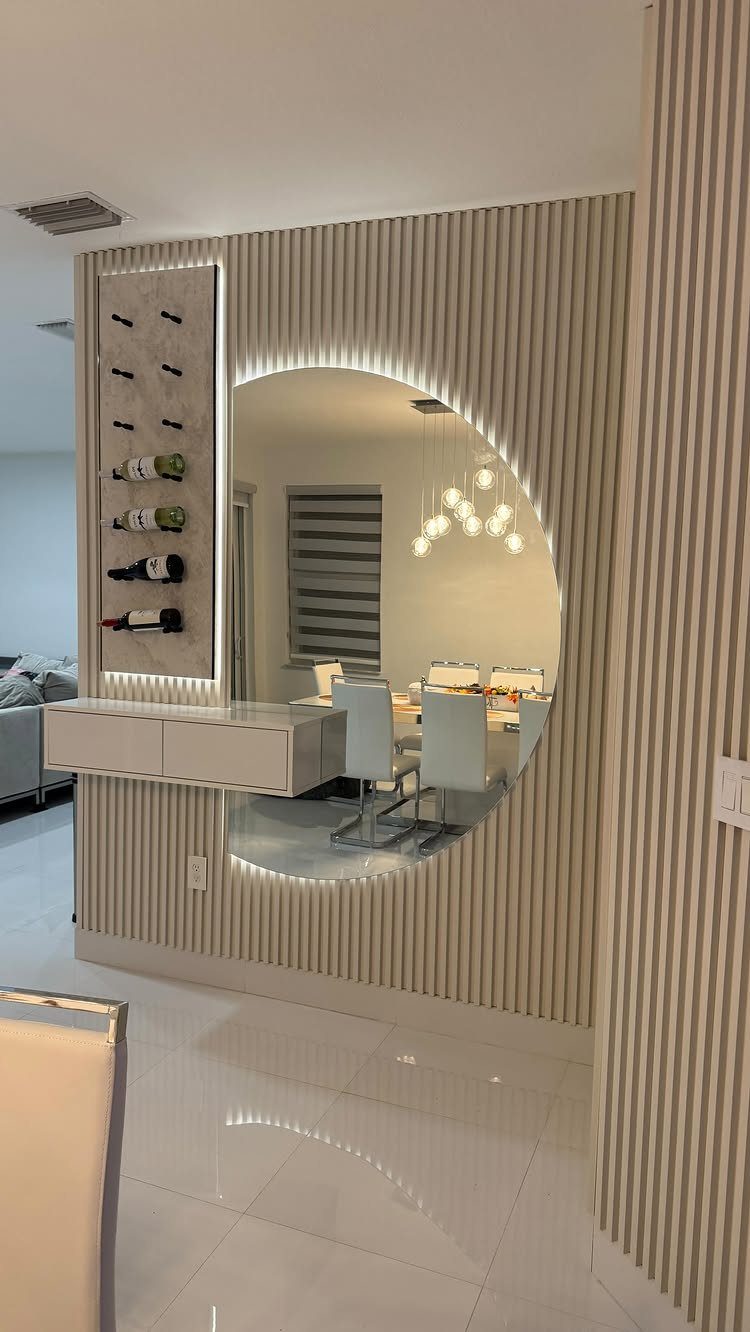
Light wood slats run floor to ceiling and turn one wall into texture that catches side light. The vertical lines stretch a low ceiling; in a room with generous height I might run them horizontally instead.
Built-in wine racks and a floating shelf make this a working wall, not just a feature. I specify slats at gaps close enough to read as surface, open enough to cast shadow.
Backing with black paint behind the slats deepens the recesses. The circular mirror with its own light breaks the rhythm at a point that draws the eye across the whole composition.
16. Built-In Arched Bookshelves
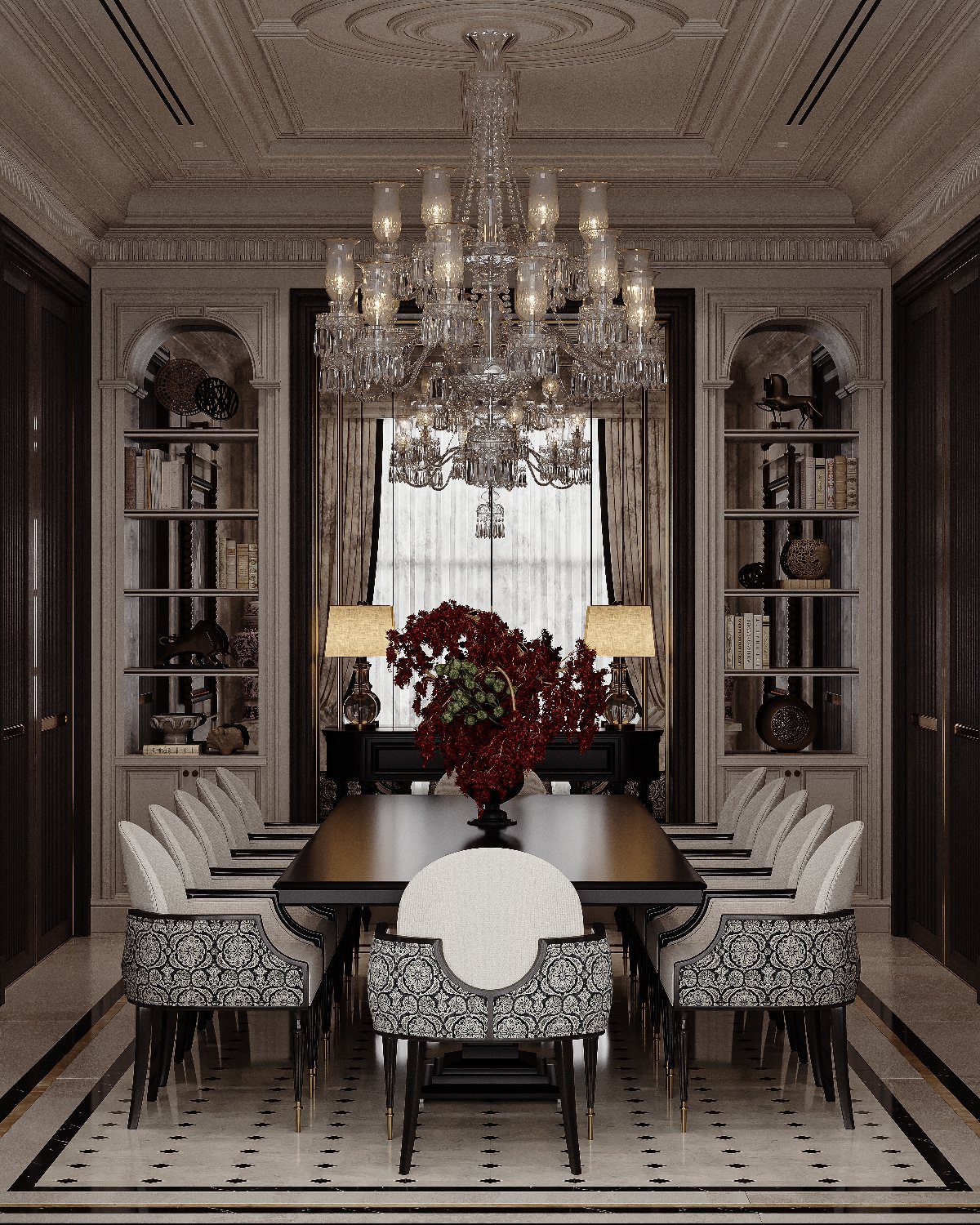
Recessed arches frame whatever sits inside them as belonging to the room’s architecture. The curved top softens the formality of a long table.
I keep the contents simple: a stack of books, one object, negative space.
Filling every shelf turns built-ins into clutter catchers. The mirror and window centered between the arches give the wall symmetry without matching contents.
This is new construction or a serious remodel, not a weekend project; the trade is permanence for presence. Where recessing is impossible, shallow arched cabinets hung flat to the wall give a similar outline.
17. Illuminated Organic Wall Niches
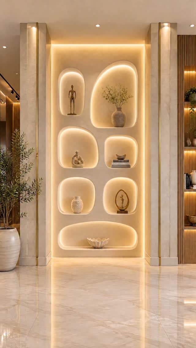
Recessed alcoves in irregular shapes turn a wall into something carved rather than built. Warm LED inside each niche grazes the objects and the surrounding plaster, which makes the whole surface glow after dark.
I shape these with framing and drywall mud, not stone, because the form is the point and the material stays hidden. Each niche needs its own driver, accessible for replacement, since integrated lighting eventually fails.
The vases inside should be simple; the niche itself is the sculpture. For renters, shallow wall-mounted shelves in freeform plywood silhouettes give a similar outline without the demolition.
Choosing the Right Size and Layout
Size the art or grouping to about 60 to 80 percent of your table width. That proportion keeps the wall connected to the furniture below without swallowing it.
Hang the center of the piece 57 to 60 inches off the floor, which lands at standing eye level for most adults and keeps the work visible as people move through the room.
Ceilings above 9 feet give you a little room to raise the center, but not much or the piece starts to float.
For a grid, keep gaps tight at 1.5 to 3 inches so the collection reads as one unit, not scattered singles.
Leave 6 to 12 inches of clearance above a sideboard or table surface so the arrangement has room to breathe and you can still set down a centerpiece or candles.
Paper templates taped to the wall for a day beat guessing; live with the shape before you commit to nails.
Coordinating Decor with Lighting
Place mirrors where they catch window light or bounce the chandelier, then dim the overhead fixture for the meal itself.
Surrounding frames should sit slightly smaller so the visual hierarchy stays obvious and the eye knows where to land first. Wall sconces around artwork or mirrors draw the eye where you want it.
Run bulbs between 2700 and 3000 Kelvin.
That warmth flatters skin tones and keeps the room from feeling like an office after dark. Dimmable bulbs let you drop the sconces low for dinner, then raise them when you need to clear the table.
Creating a Cohesive Color Palette
Pull a dominant color from your dining table, chairs, or rug for the wall art, and that grounds the wall in something you already own instead of forcing a new scheme.
Repeat the same metal finish across frames, sconces, and hardware. One brass tone threading through the room ties pieces together that otherwise have nothing to say to each other.
Contrast keeps the wall from going muddy.
Light walls call for dark frames; dark walls need light ones so the edges read crisp rather than dissolving into soft blobs. The 60-30-10 rule is a useful check: about 60 percent dominant color, 30 percent secondary, 10 percent accent.
In a dining room, the walls and large furniture often carry the 60, the frames and textiles the 30, and a single metal or saturated hue the 10.
Frequently Asked Questions
What are the best dining room wall decor ideas?
The most effective approaches combine one high-impact move with layers that feel personal.
Plate displays work best for pieces you’ve collected over time, sculptural art adds shadow and movement that shifts through the day, and floating shelves let you rotate objects as the seasons change.
One large mirror or a horizontal painting centered above the table gives the room a focal point that doesn’t fight with conversation or the food on the plate.
How do I pick the right size for dining room wall art?
Size the art or grouping to roughly 60 to 80 percent of your table width; that proportion keeps the wall tied to the furniture without overwhelming it.
With ceilings over 9 feet you can nudge the center up a few inches, but push it too high and the art loses its connection to the room below.
Tape paper templates to the wall and walk past them for a full day; the shape changes under morning light and evening shadow, and nail holes are permanent.
Can a gallery wall work in a dining room?
Yes, if you keep the grid tight and the palette disciplined. Matching slim frames under 1 inch, wide mats that let the prints breathe, and gaps of 1.5 to 3 inches between frames turn separate pieces into a single statement.
A grid of 9 identical frames once turned overwhelming botanical wallpaper into something intentional; the frames held steady while the prints inside pulled out colors already running through the paper.