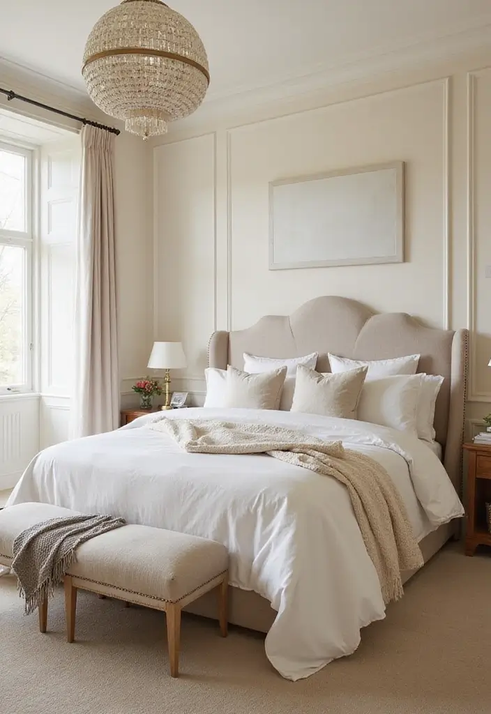
I put this post together because a simple paint choice can wake up a room without spending a lot. Lately I keep hearing from readers who want a calmer, cozier spot to rest, study, and dream. This guide on 25 paint ideas for bedrooms is built to help you get that fresh look with less fuss. We’ll talk about colors, finishes, and how paint behaves with natural and artificial light.
This is for anyone who wants a room that truly feels like them. If you share a bedroom with a partner, roommate, or student, this guide can help you find a calm compromise. If you are moving, redecorating, or simply tired of the same walls, you will find simple, doable ideas.
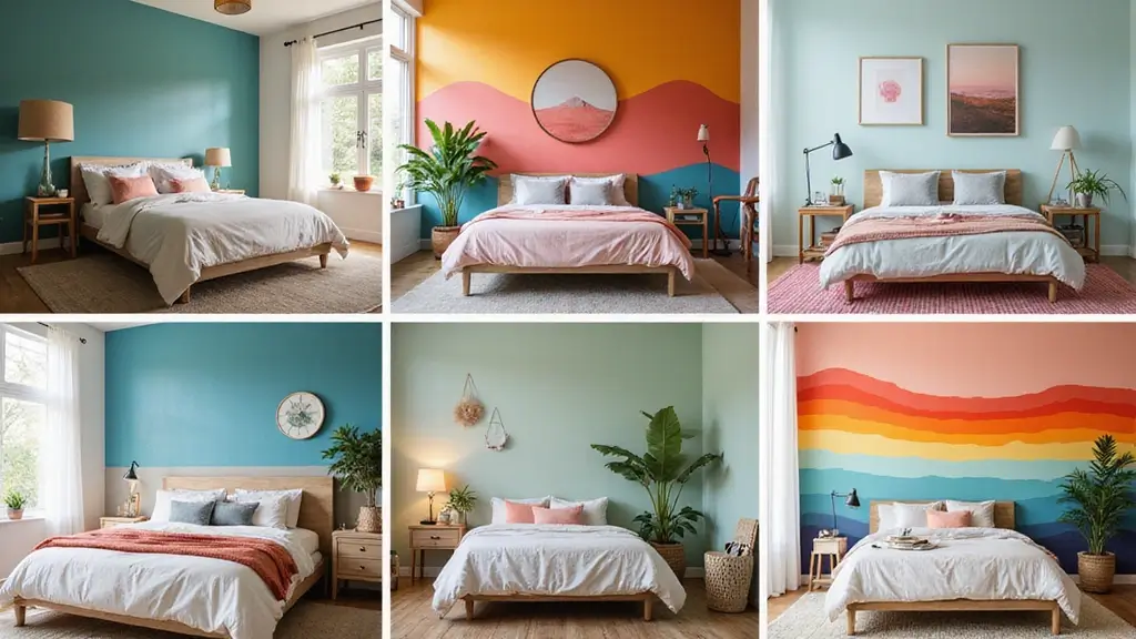
Here you will find 25 ideas grouped into palettes that fit different moods. Soft neutrals, rich blues, warm greens, and light pastels give you many starting points. I’ve noted how each shade behaves in different light and what it pairs with, from bedding to wood furniture. What you’ll get is practical, ready-to-try advice, plus finishes and swatch tips to help you decide.
Get tricks to test color at home. You can start with large swatches on three walls and see how they look in morning, afternoon, and night. Choose a finish that is easy to clean in a bedroom, like eggshell or satin. I explain how to balance bold colors with soft neutrals for a restful space.
Color reads differently with different lighting, so trust your eyes more than a photo. Start with one wall if you want a grounded look, and build from there. Think about how paint affects mood, sleep, and focus as you plan.
Next steps are simple: pick one idea you like and test it this weekend. Gather swatches, clear space near the wall, and plan for two coats. If you want more, the rest of the post dives into all 25 ideas with quick setup tips.
1. Calming Sage Green
Are you after a bedroom color that feels calm and fresh at the same time? Sage green is your answer. This soft, earthy shade brings a touch of nature inside and helps you unwind. You can use it as a whole-room backdrop or let it shine on one wall as an accent. It pairs well with white trim and light wood furniture, keeping the space bright and welcoming. A few houseplants can lift the mood even more.
– On walls: start with sage green across the room for a peaceful, cocoon-like feel.
– Accent wall: paint one wall for a subtle pop while the rest stay pale.
– Palette pairing: stick with white or pale wood for clean contrast.
– Finish choice: choose matte or eggshell to soften the look and reduce glare.
– Plants and lighting: add a tall plant and warm lighting to mimic natural light.
Here is why this approach works: the color slows the eye, the natural accents reinforce calm, and the overall balance stays versatile with other decor.
Tip: Look for low-VOC or zero-VOC paints to keep indoor air fresh.
Next steps: test swatches across a few daylight hours, compare trim colors, and move from one wall to all four if you love the feel.
2. Bold Terracotta
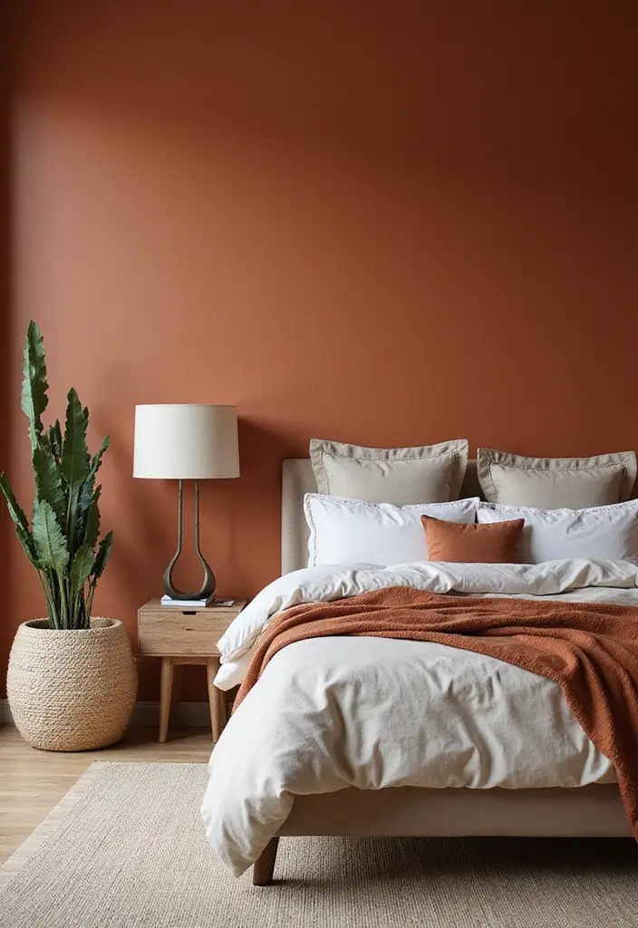
You want a warm, bold look without shouting. Bold terracotta can give your bedroom depth with a calm feel. This earthy red-brown hue adds character and a rustic touch you can live with every day.
Start with the basics. Pair terracotta with neutral accents like beige, cream, or sand. The contrast keeps the room balanced rather than loud. Use terracotta on an accent wall to anchor the space. A wall behind the bed becomes a strong backdrop for art, a statement headboard, or a favorite throw.
Finish matters. A matte or eggshell finish keeps the color soft and cozy. If your light is bright, go lighter on the terracotta. If you have plenty of natural light, you can go deeper.
Practical steps you can take now. Buy a few swatches in different terracotta tones. Check how each looks at morning and evening. Test on a small patch before you commit.
Texture adds life. DIY Texture Tip: Use a sponge or soft brush to dab and swirl. Light pressure builds depth without looking muddy. Let colors layer in gentle, irregular patches for a handcrafted look.
Mix in natural materials. Wooden furniture, brass accents, or a woven rug lift the color. You get warmth, style, and easy care with this earthy tone.
Bold terracotta brings warmth and character to your bedroom. Pair it with neutrals for a balanced look that soothes the soul and transforms your space effortlessly!
3. Soft Lavender
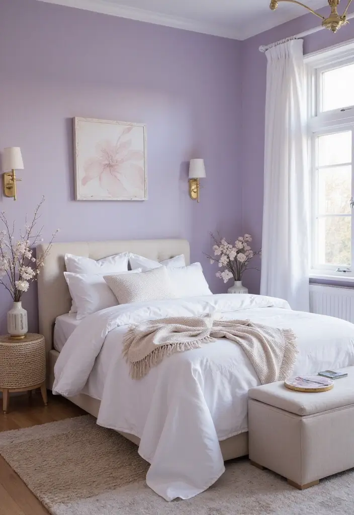
If you want a soft, inviting bedroom, lavender can be your best ally. Here is why it helps: it calms the mind and nudges you toward sleep.
Let’s break down how to use it. Pick your shade first. A pastel lavender feels airy, while a deeper lilac adds depth.
Next, decide where it shows. Paint the walls for a big impact, or weave lavender into textiles, such as pillows, throws, and art, for a gentler touch. If you share a small room, start with textiles first.
Here is how to pair it well. White or soft gray furniture keeps the room bright. Add deeper purple accents in pillows or a statement art piece to create depth. For a bold but balanced look, pair lavender with a crisp white sheet set and a warm wood bed frame.
Color Scheme Suggestion: Lavender, cream, and gold accents create a calm and refined space.
Next steps:
– Use lavender as the main wall color or as accents to suit your mood.
– Balance with white or gray furniture and warm textures like wood.
Tip: warm lighting helps lavender feel cozy, not cold. Avoid overdoing purple; let neutrals breathe.
Test swatches, view at different times of day, and adjust.
4. Energizing Mustard Yellow
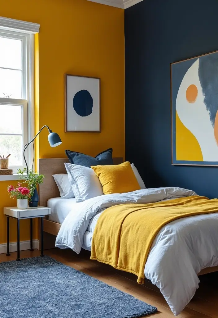
You want a color that wakes up a sleepy bedroom. Mustard yellow does that without shouting. It adds warmth and a sunny vibe you can feel.
Here is why it works. It lifts mood and gives a playful touch. Use it on a single wall or as part of a two‑tone scheme so the room stays balanced.
– Where to use it: try an accent wall in mustard or introduce a panel or strip along the headboard. Keep the rest of the walls a softer shade to prevent glare.
– Pairings that pop: navy or teal create a strong, quiet contrast. White trim or light wood furniture helps the yellow breathe.
– Design ideas you can try: add thin geometric shapes, such as stripes or hexagons, on the mustard wall. A simple stencil can add texture without overdoing it.
– Finishes to consider: matte or eggshell on walls softens the glow. Reserve gloss for trim and small accents to catch the eye.
– Practical tips for real life: natural daylight brings out the warmth, and warm LED lighting deepens it after dark. Balance brightness with soft textiles like cotton sheets and linen curtains.
Here is how to implement it. Start with a sample swatch, then test several mustard shades from pale to deep. Plan your accents before you paint. For the best look, keep the rest of the room calm.
Tip: If the color feels loud, add taupe or cream pieces in bedding or an area rug.
Next steps
– Choose a shade and gather swatches
– Paint a test patch in natural light
– Decide on the wall, trim, and fabric colors
– Install soft textures to finish the look
5. Soothing Blush Pink
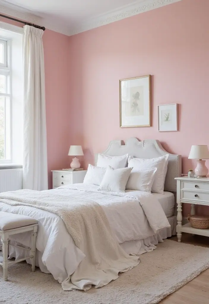
Want a bedroom that feels calm and inviting? Soothing blush pink does that without trying too hard. You can paint all the walls for a soft, enveloping mood, or pick one wall and use a deeper rose as an accent behind the bed.
Here is why it works. Blush pink adds warmth and light, which helps a small room feel cozier. It plays nicely with white bedding, light gray furniture, and metal lamps or frames. It creates a gentle backdrop for art and photos too.
How to use it, step by step. – Paint all walls in blush for a uniform, peaceful look. – Or highlight one wall as an accent behind the bed and keep the rest lighter. – Use white trim and a white ceiling to brighten the space. – If your room gets a lot of sun, choose a cooler blush; if it’s darker, go with a warmer tone.
DIY Tip: Use a matte finish for a sophisticated, modern feel.
Add a touch of texture without shouting. Subtle stenciling or a light glaze can give walls character. Try a soft leaf pattern or thin geometric lines in a white or pale metallic shade.
Next steps. 1) choose a blush shade you love. 2) test swatches on different walls at different times of day. 3) prep surfaces, prime if needed, then paint in thin, even coats. 4) finish with warm lighting and comfy textiles.
6. Striking Navy Blue
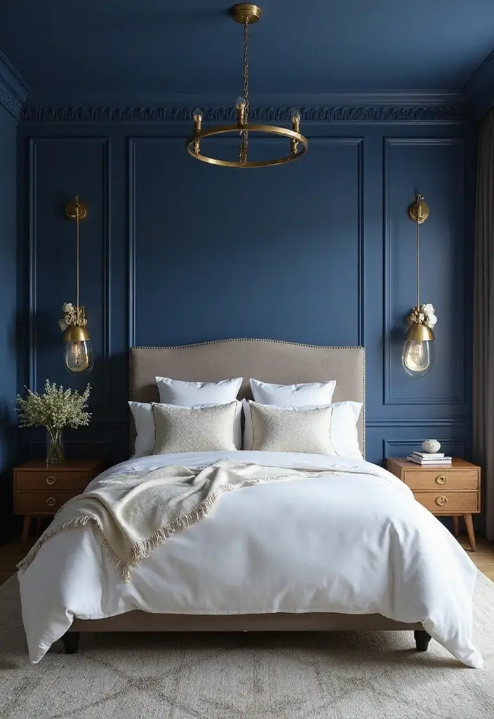
Striking navy blue can anchor a bedroom with ease. It adds depth and a calm, chic mood you can feel. Here is why it works and how to use it well.
– Choose the right navy
Test swatches in your room at different times of day. Look for a shade that stays rich but not too black. A navy with a touch of gray or a hint of green settles nicely in natural light.
– Decide on walls
You can paint one wall for a bold accent or cover all four for a cozy night-sky vibe. An accent wall is easier to refresh later if you want to switch looks.
– Add texture
Mix in texture with sponge or rag technique on a wall. A soft, uneven finish catches light and adds interest without overwhelming the space. Pair with smooth white trim to keep it crisp.
– Pair colors and materials
Gold or brass accents feel luxe with navy. White furniture or bedding keeps the room bright. Light wood or warm textiles add balance and warmth.
– Lighting matters
Layer light with a ceiling light, bedside lamps, and warm bulbs. Gentle lighting makes navy feel inviting rather than heavy.
– Practical tips
Choose eco-friendly paints to cut VOCs. This helps your sleeping air stay fresh and clean.
– Watch the size and mood
Very dark walls can make a small room feel snug. If your space is tight, balance navy with a bright ceiling and light textiles.
Next steps
Grab swatches, check how the color looks in your light, and plan a small test area first.
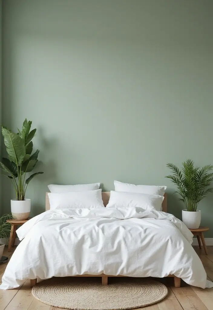
7. Earthy Olive Green
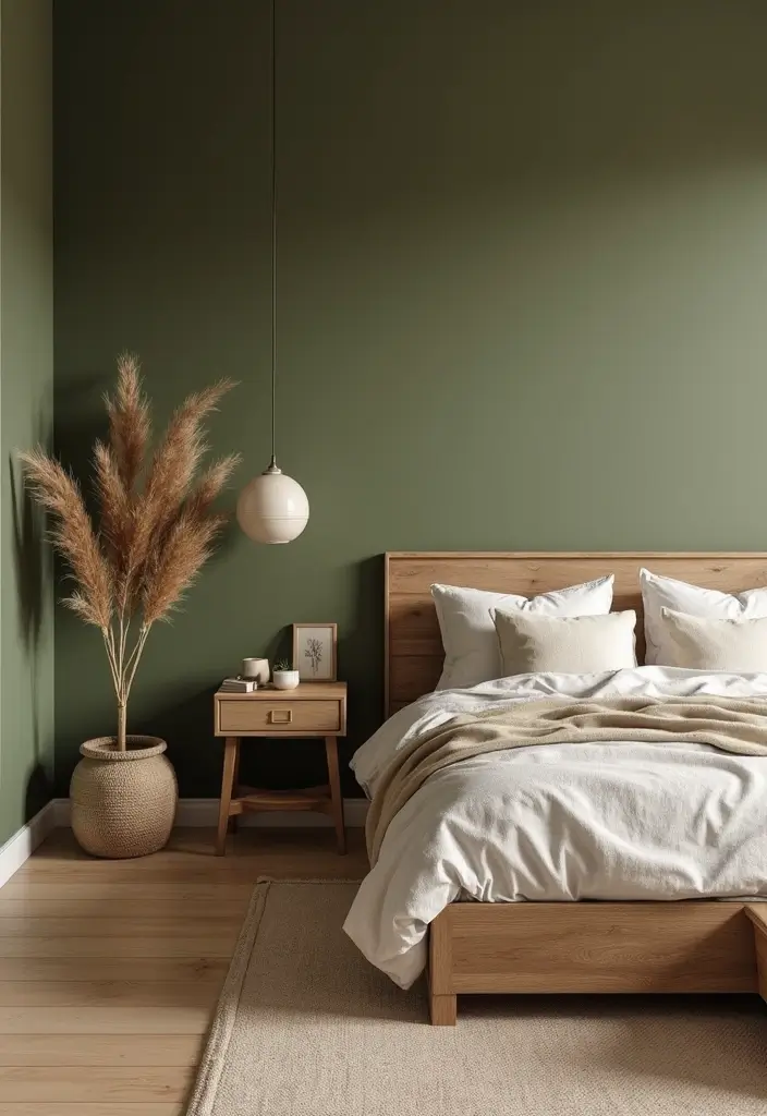
Seeking a calm, nature-inspired bedroom that still feels fresh? Earthy olive green can be your anchor. It invites the outdoors inside without shouting. You get a soft mood that helps you unwind, and it plays well in morning light or dim lamps.
Here is why it works: this green adds depth and balance. It pairs with wood and warm textiles. It stays calm with a busy rug or pillows.
How to use it
– Paint all walls for a quiet backdrop.
– Create an accent wall behind the bed to draw the eye.
– Olive on trims or the ceiling lifts the look.
– Olive on a shelf or headboard can be a focal point.
Pairing ideas: Mix with beige or soft brown for warmth. Add white for contrast so olive stays calm. For depth, use charcoal gray or brass accents.
Decorative touches keep the look calm. Use leaf patterns or a light stencil on a small panel. Add cushions in olive tones to echo the walls.
Finish and texture matter. Choose a matte or eggshell finish to limit glare. Linen curtains and a wool rug add warmth.
Color Scheme Tip: Olive, cream, and natural wood create a balanced look.
8. Cool Gray with Texture
You want a bedroom that feels calm and put together. Cool gray can be your quiet base. It works with many accents and helps the room breathe. It also makes light feel soft, not harsh.
Here is why texture matters. Texture adds depth without loud color. It makes a flat wall feel inviting.
– Step 1: Pick your base gray. Look for blue-gray or green-gray undertones. Test swatches on different walls and lighting. Choose two shades that blend.
– Step 2: Add texture. Try an ombre wall fading from light near the ceiling to darker at the floor. Or a textured sponge finish for a soft, repeating pattern.
– Step 3: Add color with care. Use bold pillows or art in a few colors you love. Keep most items gray and white so the room stays calm.
– Step 4: Eco-friendly paints. Choose low-VOC or zero-VOC water-based options. They help air stay fresh. Open windows after painting.
– Step 5: Tie it together. White trim, light ceiling, and natural wood furniture anchor the look. Add cozy textiles like cotton sheets and wool throws for warmth.
Tip: Use different shades of gray to create a layered, interesting appearance.
Next steps: test your favorites on a small wall patch, check how they look in morning and evening light, then commit to a plan.
9. Vibrant Coral
You want a bedroom that feels awake without shouting. Coral helps you get that sunny, friendly mood. It adds warmth and keeps the room looking clean. Pair it with white trim or navy accents for balance.
– Where to use coral Paint one wall in coral to create a focal point you notice as you enter.
– Coral on the ceiling adds a playful twist and draws the eye upward.
– Try coral on the headboard wall or on small furniture pieces for a quick pop.
– Even in a small space, coral can brighten the room when you keep the rest light.
– Pairing and patterns Use white or soft gray to calm the room.
– Create texture with patterns like stripes or blocks in coral and white.
– A coral ceiling with pale walls can make the space feel airier and taller.
– Finish and lighting Matte finishes look cozy, while satin catches light for a subtle glow.
– Let natural light work with coral. Paint swatches in daylight to check mood.
– Eco tip Choose low-VOC or water-based paints to keep the air fresh.
– Use small sample pots on different walls to test how coral shifts with light.
Here is why it works: coral reads warm in morning sun and stays friendly as daylight shifts. It also blends with many colors you already use.
Next steps: pick a shade, test it, and plan your two-tone layout.
Vibrant coral is your secret weapon for a cheerful bedroom! Just a splash can create warmth and light, making any space feel fresh and inviting.
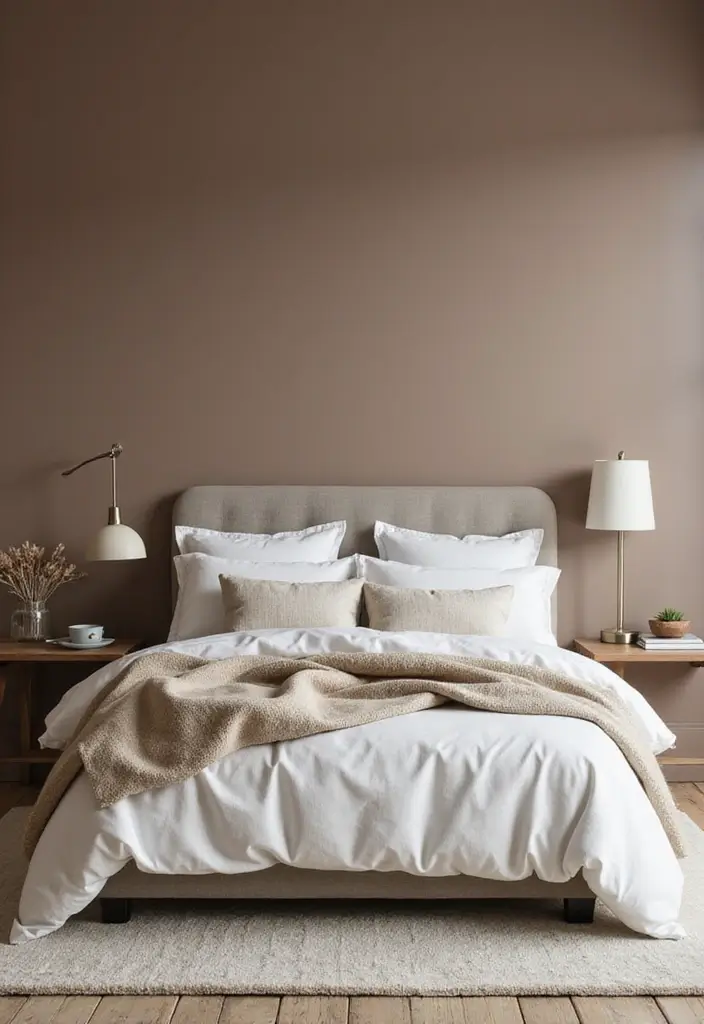
10. Warm Beige
You want a calm, cozy bedroom, not a flat wall. Warm beige gives a soft, neutral backdrop that invites rest. It makes natural light feel warmer and your space look more open.
Here is why warm beige helps a room stay inviting. The shade carries honey or cream undertones that read friendly, not dull.
Next, we break it down into practical steps you can use today.
– Pick a beige with warm undertones, like honey or cream.
– Test small patches on different walls and check in morning and evening light.
– Layer in textures and wood. Think throws, curtains, and a bed frame in warm browns.
– Add a subtle stencil or a light glaze on one wall to create depth without shouting.
– For lighting, choose bulbs around 2700K and use a dimmer to keep the mood soft.
Tip: Use different fabrics such as wool, linen, and cotton to bring texture against beige walls.
Next steps: start with a single wall test patch this week, then build the look with soft textiles and warm lamps. With care, your beige room will feel inviting, timeless, and easy to refresh.
11. Chic Black Accent Wall
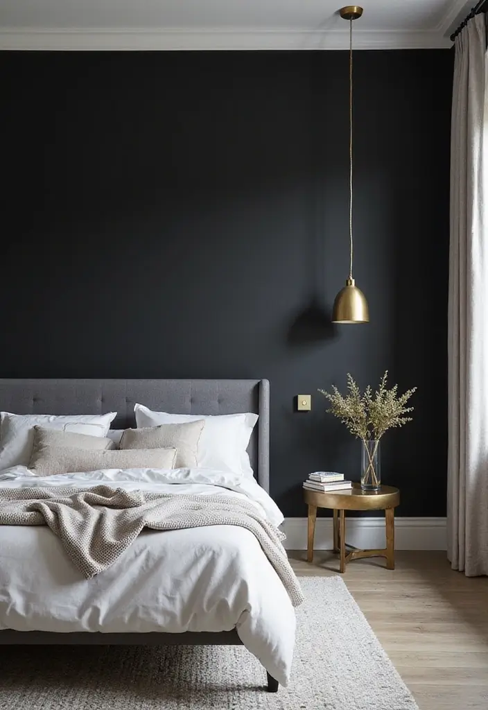
If you want a bold, stylish bedroom, a black accent wall can anchor the space. It adds depth and a calm energy you can build around.
Here is why it works: dark walls contrast with light furniture and make art pop. It can feel refined, not heavy, when you pair it with soft textiles and warm light.
– Pick a shade of black
Black is not the same in every paint. Check swatches in morning and night. Test a few tones on larger patches before you commit.
– Choose a finish
Matte hides flaws and feels modern. Satin or soft gloss catches a bit of light and looks polished.
– Test and plan
Paint a large swatch on the wall and live with it a few days. See how it works with ceiling, floor, and furniture.
– Texture and technique
Add depth with a glaze or subtle sponge. A light gloss on edges can catch daylight. Rag rolling creates nuance.
– Decor and balance
Pair the wall with light furniture, pale bedding, and metal accents like gold or silver.
– Lighting matters
Use warm bulbs and layered lamps to soften the space. A mirror helps bounce light around.
Tip: Keep the rest of the room light to avoid a cramped feel.
12. Calming Seafoam Blue
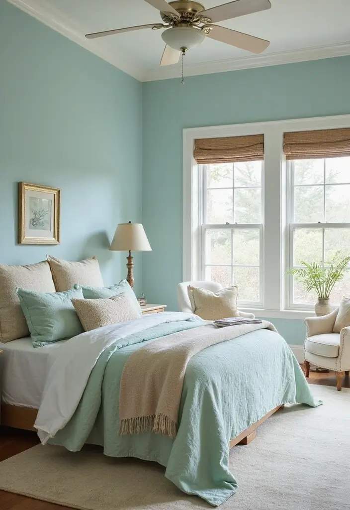
If your bedroom needs a calm, seafoam blue can be your best friend. This soft blue brings in light and air while keeping the mood peaceful. Use it on all walls for a soothing canvas, or pick one wall as a quiet accent to guide the eye.
Where to use seafoam blue
– Cover the whole room for a gentle, enveloping calm.
– Choose a single wall as an accent to create a focal point.
– Try it on the ceiling for a bright, airy feel.
Color pairings that read as beachy
Pair seafoam blue with white trim and sandy beige furniture or textiles. Light wood furniture warms the space. A few natural fibers like linen curtains or wicker baskets reinforce the coastal vibe.
Texture and paint techniques
Keep the finish soft with matte or eggshell sheens. A light sponging or rag-rolling technique adds depth without making the room busy. These subtle touches catch the light and add character.
DIY tip
Add natural elements to reinforce the theme. Driftwood, shells, or sea-glass placed on a dresser or shelf bring in tactile reminders of the shore.
Practical steps to try
– Test swatches on your wall at different times of day.
– If you like the shade, apply two coats for even color.
– Finish with a low-sheen topcoat to keep the look calm.
Common questions
Will it look green in some lights? A touch of white trim helps keep the blue true. If the shade feels too pale, swap to a slightly deeper tone.
Next steps
Choose a seafoam hue, sample it in your space, and plan simple coastal accents. With the right balance, you gain a serene, stylish bedroom you’ll love waking up in.
Transform your bedroom into a tranquil retreat with calming seafoam blue. Whether it’s all walls or just an accent, this hue invites peace and light into your space!
13. Fun Turquoise
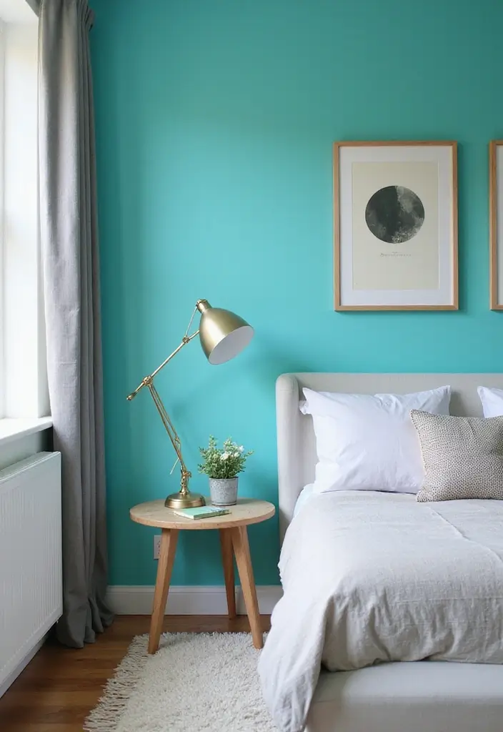
Turquoise can wake up a bedroom without shouting. It brings a space that feels bright, friendly, and easy to live in.
– Role of color: Use turquoise as an accent wall or as the main hue. White walls read clean and airy. Gray walls add a modern touch.
– Wall ideas: Try a turquoise stripe, or a simple block pattern on a feature wall. You can also paint a single panel behind the bed to create focus.
– Lighting matters: Turquoise looks best in natural light. Open blinds so the sun softens the color and keeps the room lively, not loud.
– Textures and furniture: Pair turquoise with warm wood, soft cottons, and metal accents. A white duvet, wood nightstands, and a turquoise lamp tie the space together.
– Accessories and balance: Tip: Use small accessories in colors near turquoise or opposite on the color wheel. Navy, coral, or sand tones work well.
– Quick steps to try at home:
1) Paint a small wall swatch in two sheen levels (matte and satin) and pick what feels right.
2) Add turquoise bedding or a throw to test the vibe before repainting large areas.
3) If you go bold, keep the rest of the room quiet with white or pale gray walls.
Next steps: choose a spot, gather a few samples, and start small.
14. Elegant Charcoal
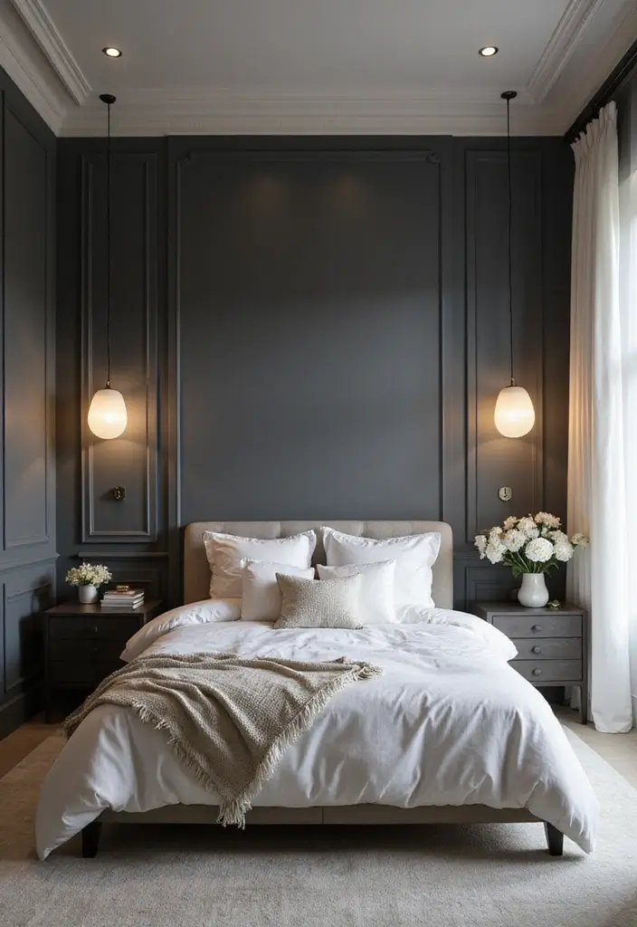
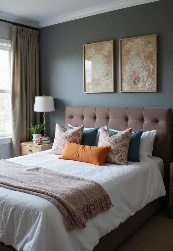
Are you looking for a way to add depth without weight in your bedroom? Charcoal gray gives a refined, calm look that pairs well with light accents. It works as a full wall for drama, or as a bold feature wall you can grow with.
Here is why it helps: the dark color makes light furniture and pale textiles stand out, while still feeling cozy. When you add warm whites, ivory, or blush tones, the room stays inviting instead of moody. A soft glaze or subtle ombre can give depth and texture to this dark shade. Tip: Warm lighting softens the edge of charcoal walls.
Next steps to pull it off:
– Choose a charcoal shade with a hint of blue or green for depth.
– Test swatches on your wall at different times of day.
– Decide between one accent wall or full-room color.
– Pair with warm whites, cream, or soft pink for balance.
– Choose a finish: matte for a modern look or satin for easier cleaning.
– Add texture with fabrics like velvet or linen.
– Try a simple glaze or light ombre to add nuance.
– Plan your painting: prep, tape, prime, two coats, finish.
– Light it well with warm bulbs and dimmers.
– Do quick touch-ups and regular dusting to keep it fresh.
15. Refreshing Mint Green
Mint green in a bedroom brings a fresh lift. It lights the room without shouting. You wake to a calm, clean glow.
Here is how to use it well.
– Paint a mint accent wall for a clear focal point.
– Bring in mint with soft pieces like curtains, a rug, or throw cushions.
– Pair mint with coral or soft peach accents for a friendly, modern vibe.
– Add decorative stencils on mint walls for a subtle, unique pattern.
DIY Tip: Blend mint with soft grays to calm the look. White trim helps the color stay crisp.
Next steps:
– Pick a mint shade that fits your room light. The same color can look different in sun or shade.
– Test samples on the wall at morning and evening.
– Use white or light gray on big pieces so the mint remains the star.
What to mix with mint:
– Natural wood for warmth.
– Soft whites to keep it airy.
– Small pops of coral or peach lift the feel.
Lighting matters. A sunny room makes mint look brighter. In dim light, add a white bed frame to keep contrast.
Common questions:
– Will mint clash with wood? If wood is warm, keep patterns simple.
– How many mint items should you use? Start with accents, then add more if you like it.
Mint green is flexible and easy to update.
16. Stylish Plum
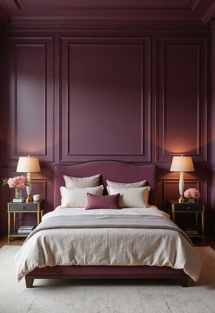
You want a bedroom that feels chic and calm, not loud. Plum offers that mix of depth and warmth. This rich shade adds character to walls and helps your furniture shine.
Here is why it works. It reads refined and inviting. It pairs easily with metal accents and shifts with the light in your room.
– Accent wall or full room: Start with plum on one wall to create focus, or paint all four walls for a bold, enveloping feel.
– Choose the finish: Matte gives a soft, velvety look. Satin or gloss adds shine for a luxe effect.
– Balance with neutrals: Bring in light furnishings in cream, beige, or taupe to soften the color and keep the space open.
Pairing ideas you can try
– Metal accents: Gold or brass lamps and frames pair with plum for a regal vibe.
– Soft textures: Velvet cushions, linen bedding, and a wool rug make plum feel cozy, not heavy.
– Smart lighting: Warm bulbs and layered lighting keep the color rich without feeling dark.
Practical steps to get it right
– Test it first: Gather swatches and paint a sample panel to see how plum shifts in day and night light.
– Build the palette: Choose two neutrals and two metallic accents to guide your decor.
– Add finishes gradually: Start with a few statement pieces, then add more as you love the look.
A quick caveat and light guidance
– Small rooms: In tight spaces, use plum on one wall or in textiles to avoid a cramped feel.
– Refresh later: If you want change, swap textiles first before repainting.
17. Crisp White with Colorful Accents
Here is why crisp white walls work for a bedroom. They bounce light around the room. They make the space feel bigger. You get a calm base that can grow with your style.
Next steps: choose two or three color accents that fit your daily life. Try teal with pink. Or navy with lime. Pair cream with charcoal. Keep colors bold but balanced so white never looks empty.
How to add color without crowding the space:
– Hang wall art in bright hues that match your textiles.
– Add patterned cushions and colorful throws on the bed or chair.
– Choose curtains, rugs, and bedding in your palette.
– Try a stencil on a wall or use removable decals for a playful touch.
Texture matters. Mix matte paint, glossy finishes, woven fabrics, and soft throws. The mix keeps the room warm and inviting.
Be practical. Test color swatches near natural light before painting. Use removable decals for easy updates. Add a small pop of color on one wall with a subtle stencil to avoid overwhelming the room.
Tip: Use texture to add depth and warmth to white.
18. Deep Burgundy
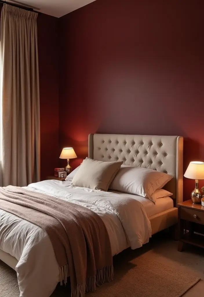
You want a bedroom that feels cozy and rich. Deep burgundy adds warmth without shouting. It reads calm when you pair it with soft light.
Here is why burgundy works in a bedroom:
– Use burgundy on one accent wall. It creates a focal point.
– Add it in textiles. A burgundy duvet, pillows, or velvet curtains bring softness.
– Try it on furniture accents. A headboard or small dresser adds depth.
– Pair with creams or whites. Lighter tones keep the space balanced.
– Bring in warm wood and brass. This mix warms the room.
– Add a subtle metallic glaze for quiet drama.
Next, how to pull it off:
– Choose a finish that fits your vibe. Matte looks cozy; satin adds a gentle shine.
– Keep lighting warm. Amber bulbs help burgundy glow.
– Add texture. Soft bedding, wool throws, and woven curtains keep it comfy.
– Build a simple palette. Pair burgundy with cream, ivory, or taupe.
If you search for deep burgundy paint for a bedroom, start with an accent wall and test swatches first.
Here is a quick testing plan:
– Paint a mini swatch and view in day and night light.
– Move the swatch around to see how it reads from different angles.
– Bring in sample fabrics to feel the mood before you commit.
Next steps.
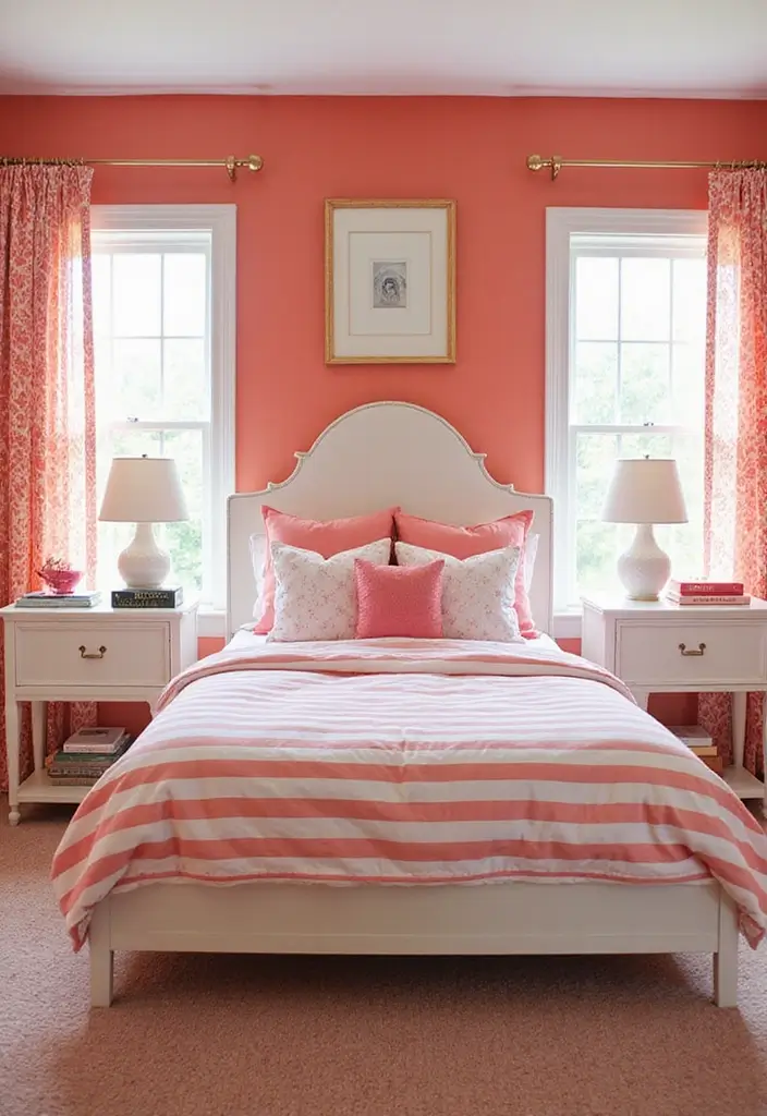
19. Playful Peach
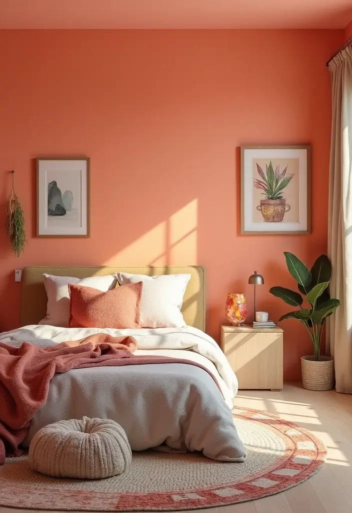
You want a bedroom that feels warm and welcoming without shouting. Peach does that job. It adds light and soft energy, especially in rooms that lack sun.
Choose the right shade. Look for a muted peach rather than a candy pink. It will read more like a warm nude in most light. Pair it with taupe or soft browns to keep the backdrop calm. These tones give you depth without dulling the room.
Where to use peach? An accent wall is a smart start. It centers the space and makes a statement without taking over. You can also color the whole room if you want a full mood shift. White or cream trim helps keep edges clean and bright.
Here is why it works. Peach invites comfort and makes fabrics feel cozy. It also plays well with natural textures like wood and flax.
Practical ideas you can use today.
– Add patterned bedding in peach, cream, and a touch of navy.
– Bring in colorful accessories like pillows, vases, and lamps.
– Try decorative painting ideas such as light stencils or small texture effects on the walls.
– Use warm lighting to bring out the peach without turning it orange.
Tip: Balance peach with cooler tones to create a well-rounded look.
20. Timeless Cream
You want a bedroom that feels calm yet personal. Cream walls give warmth and a quiet backdrop that makes every accessory stand out. It isn’t boring if you mix soft tones and textures.
Here is why cream works. It reads warm, not stark. It blends with soft hues like sage, blush, and sky blue. It also shines with deeper accents such as navy, charcoal, or brown wood. The result is a room that feels cozy but not crowded. In this setup, light changes the mood, so choose warm bulbs and a dimmer.
Texture and art ideas help cream walls stay lively. Try a light textured finish or a soft glaze to catch a bit of sparkle. You can add depth with stencils or subtle borders along the ceiling line. Framed art, woven tapestries, or metal mirrors bring in texture without stealing the scene.
Tip: Mix different decor materials. Wood, fabric, and metal add visual interest to a cream backdrop.
Next steps:
– Pick a cream you love with warm undertones.
– Test it on a small patch before committing.
– Choose a finish: matte, eggshell, or satin.
– Layer textiles like curtains, rug, and throw blankets.
– Use lighting to switch moods.
21. Eye-Catching Fuchsia
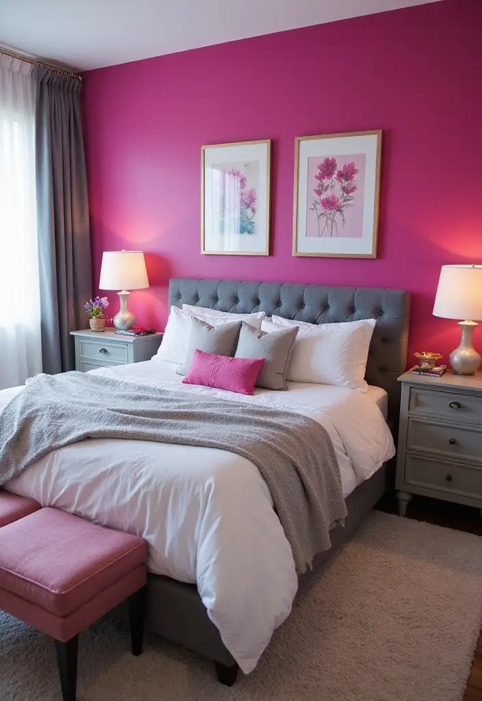
Want a bedroom that feels alive without shouting? Fuchsia can do that. Use it on one wall as an accent or as the main color if your room gets a lot of light.
Here is why it works: the shade adds warmth and depth while staying fresh. It makes white bedding and gray furniture pop.
– Start with a shade: test three swatches on the wall at different times of day. Pick the one that reads right in your light.
– Prep the space: clean the wall, fill holes, lay down drop cloths, and use two smooth coats.
– Pick a finish: a matte finish gives a calm look; a satin gloss adds a sheen for depth.
– Add a pattern or fade: try a simple geometric stripe, a soft ombre from deep to light, or a block color at the edge of the wall.
Next steps for a balanced room: pair fuchsia with neutrals. White or light gray textiles keep the scene clean. Dark gray or wood furniture anchors space. For decor, limit bold pieces and let cushions, rugs, and art carry the color.
– Lighting matters: warm bulbs soften the bold tone, while bright LEDs can wake it up.
Next steps are simple.
22. Rustic Walnut Brown
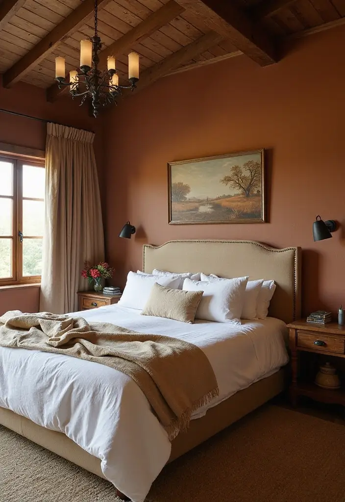
You want a bedroom that feels warm and grounded. Rustic walnut brown helps you get there. This deep earthy shade works with wood and natural materials. Try it on an accent wall to crown the room, or sweep it across all walls for a snug, cabin-like mood. Here is why: it adds depth and invites softer textures to stand out.
Balance is key. Pair walnut with lighter tones like cream or beige to keep the space open. Distressing or aging effects add texture and a hint of rustic charm. A matte finish softens the look, while a satin finish brings a gentle shine.
Next steps:
– pick a color sample
– test it on a small patch
– watch how it reads in morning and evening light
Use soft textiles to soften the intensity of the brown, plush throws, linen curtains, and wool rugs work well. If your room already has bold wood furniture, walnut walls can act as a calm backdrop rather than competing with it.
Test it gradually.
Tip: bring in natural textures to balance the dark shade.
Consider warm white bulbs and layered lighting to keep the room inviting. For a softer mood, add sheer curtains and a lightweight throw.
23. Bright Lemon Yellow
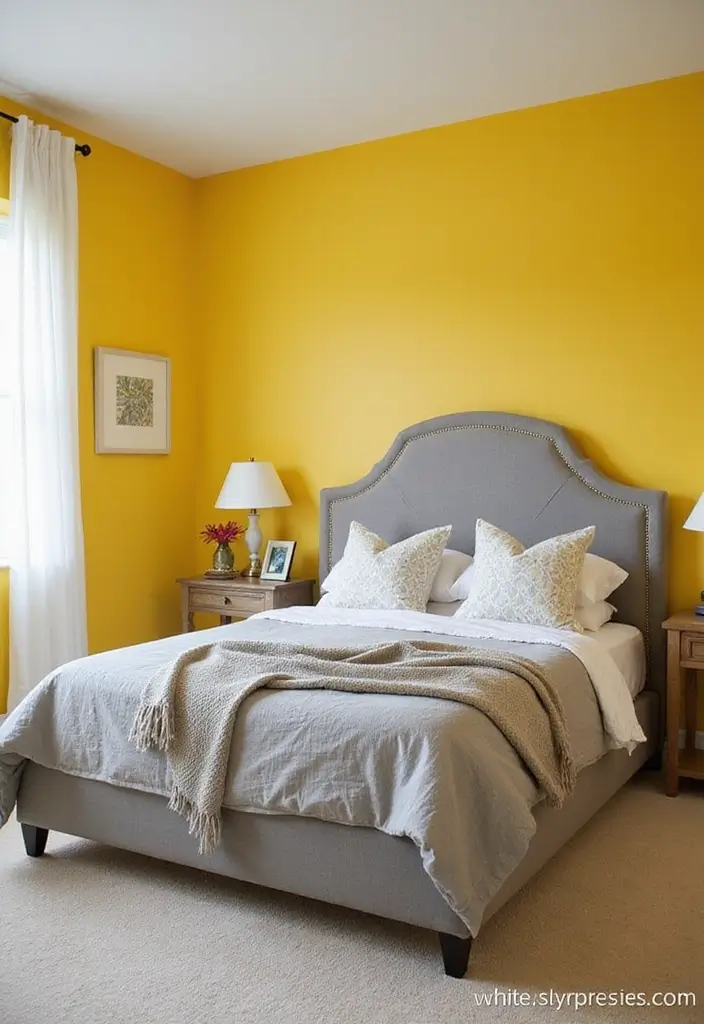
If you want a bedroom that feels sunny without shouting, try lemon yellow.
A single lemon wall can wake a tired space and add instant brightness.
Use it as an accent wall or sprinkle it on trim, a headboard, or a doorway.
Keep the rest of the room soft with whites, creams, or light grays.
Here is why it works: lemon yellow reflects light and boosts mood.
Pair it with white for a clean, fresh look.
For a modern vibe, mix gray or teal with the color.
If the room is small, lemon yellow can help it feel bigger and more open.
Add patterns or stencils on the wall to keep energy balanced, not chaotic.
DIY Tip: Balance lemon yellow with warm neutrals in textiles so the room feels calm.
If your light is cool, pick a softer lemon undertone.
Choose a finish that hides flaws and is easy to wipe, like eggshell.
Prep the wall with primer, then add two even coats.
Test color under various lights at different times of day.
Next steps.
You can tweak until it feels right.
Test the color on a small patch near the window before committing.
Wear a calm rug and soft linens to finish the look.
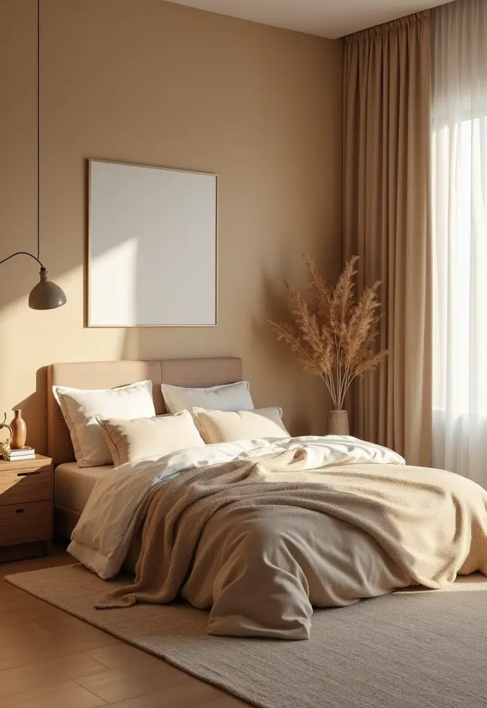
24. Earthy Taupe
Are you after a calm, cozy bedroom that still looks fresh? Earthy taupe can be the anchor you need. This warm neutral sits between brown and gray, giving walls a soft, grounding tone. It makes a small room feel bigger and a big room feel cozier.
Use taupe as the main wall color to set the mood, or pick one wall as an accent to highlight a bed frame or artwork. Start with a single wall to test light through the day.
Pair it with soft whites for a clean feel. Or use deep blues for calm contrast. Add natural wood furniture and white bedding to balance the look. Add charcoal accents for depth.
Here is why a washed glaze helps. A thin layer of lighter taupe brushed over a base coat creates gentle texture. Use a sponge or rag to add subtle variation. The result is depth without loud patterns.
Textures bring life. Try linen curtains, a wool rug, and cotton bedding. Different textures catch light and invite touch, helping taupe stay warm.
Tip: Use varied fabrics and finishes to keep the look lively. Pair matte walls with satin hardware, and reflect light with a mirror.
Next steps: test swatches on your wall, watch how the color looks in morning and evening, and pick a finish you love.
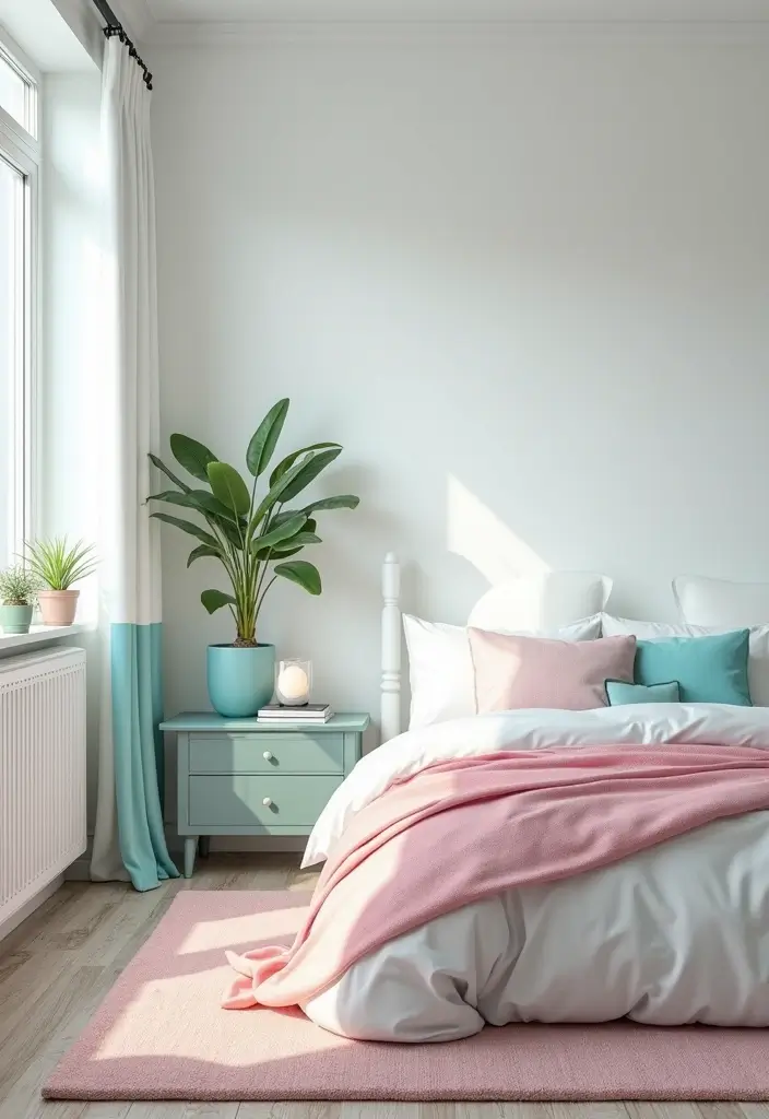
25. Soft Cotton Candy Blue
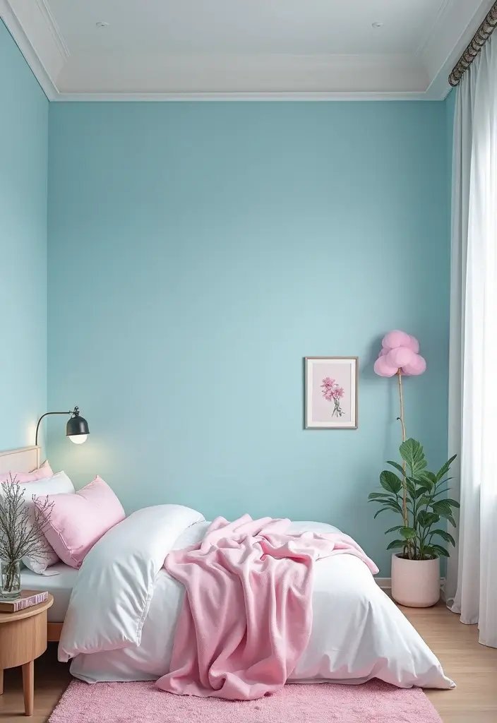
Why soft cotton candy blue works
You want a dreamy, calm bedroom. Soft cotton candy blue helps you feel relaxed the moment you wake. This pale blue opens the room and softens harsh light. Here is why: you can cover all walls for a cocoon, or use it as an accent for a playful vibe.
If you use it on all walls, choose a flat or matte finish to avoid glare. If you prefer an accent, paint one wall and balance with white trim. Pair it with soft whites for a clean look or with pinks for a sweet touch. Try cloud patterns or gentle stenciling to add whimsy.
Next steps: test two swatches on your wall, then pick the one you love most. For textiles, grab light curtains and bedding in white or pale gray. Keep fabrics light to keep the room airy. If lighting is warm, cotton candy blue reads warmer; with cool light, it feels cooler.
Here is how to set it up quickly: prime, apply two coats, let it dry, then check. Take photos in day and at night to see how the shade shifts. If the ceiling is bright, use a lighter shade on walls or a white ceiling. Good luck.
Soft cotton candy blue is more than a color; it’s a mood. Transform your bedroom into a serene oasis where relaxation reigns and dreams take flight!
Conclusion

Transforming your bedroom with a fresh coat of eco-friendly paint can do wonders for your space and your mood.
With these 25 paint ideas, you have a palette of inspiration that caters to various tastes and styles, all while being kind to the environment.
So, which color speaks to you? Dive into your DIY bedroom makeover today, and let your walls tell your story!
Frequently Asked Questions
What Are Some Eco-Friendly Paint Options for My Bedroom?
When it comes to eco-friendly paint ideas for your bedroom, look for brands that offer low-VOC (volatile organic compounds) or natural paint options. These paints are better for your indoor air quality and the environment, while still providing a beautiful finish. Brands like AFM Safecoat and Benjamin Moore’s Natura line are great places to start.
How Can I Choose the Right Bedroom Color Scheme?
Choosing the right bedroom color scheme can significantly affect your mood and relaxation levels. Start by considering the atmosphere you want to create. For a calm and serene space, opt for soft blues or greens. If you prefer something energizing, consider warm yellows or vibrant corals. Test swatches on your walls to see how they look in different lighting throughout the day!
What Wall Paint Techniques Can I Use for a DIY Bedroom Makeover?
For a DIY bedroom makeover, play with different wall paint techniques to add depth and interest. Techniques such as sponging, rag rolling, or color washing can create unique textures. You could also consider an accent wall in a bold color or pattern for a striking focal point. Don’t forget to have fun and experiment with different styles!
What Are Some Decorative Painting Ideas for My Bedroom?
Decorative painting ideas can elevate your bedroom’s aesthetic. Consider using stencils to add patterns or designs to your walls. You could also create a two-tone effect by painting the lower half of the wall a darker shade. For a whimsical touch, try painting clouds or stars on the ceiling to create a dreamy atmosphere. Let your creativity shine!
How Can I Use Accent Walls to Transform My Bedroom?
Accent walls are a fantastic way to transform your bedroom without overwhelming the space. Choose a bold color or a fun pattern to create visual interest. For instance, a striking navy blue or a playful peach can act as a backdrop for your bed or artwork. Just remember to balance it with lighter tones in the rest of the room to keep it harmonious!
Related Topics
home decor
eco-friendly paint
bedroom color schemes
DIY bedroom makeover
accent wall inspiration
calming colors
modern design
budget friendly
wall paint techniques
easy transformations
decorative painting
trending colors